I just couldn't resist making something new to show you using the latest inspiration for The Challenge. Last week's challenge will be running for TWO weeks so you have time to play if you haven't already gotten a chance! You can check out all of the details HERE. I wanted to change things up a bit and show you another "look" using these fabulous keywords!
When I made the card in my last post[scroll down to see] I really was hoping to make a card similar to what I am showing you today. I mentioned that I couldn't find my watercolor pencils so I decided to revisit the idea, but just blend my colors instead. I really like how it turned out without the pencils! I showed the watercolor panel to my daughter with excitement and I mentioned that it looked a little bit like tie-dye. She promptly told me it was hideous and only hippies would like my card! So...I really hope there are a few hippies stopping by today! Ha ha! {she did later admit that she liked it. Ah, the joys of teenage girls}
The keywords are: square (check). I was hesitant to take a big chunk out of my newly created background, but I wanted to incorporate the square in an unexpected way and I really like the result. Keyword 2: bright [check]. Nothing is as bright and cheery as a rainbow.
To begin, I adhered the Glorious Petals stencil on top of a 4 by 5 1/4 inch panel of 140 lb coldpressed watercolor paper to my mat board and applied an even coat of embossing paste over the stencil. I offset the stencil slightly so that the center was not placed in the center of the card. I immediately removed the washi tape and stencil and washed it in warm soapy water had my daughter wash it in warm soapy water. Ha Ha!
I poured crystal clear embossing powder over the entire surface while the embossing paste was still wet. I heat set it to a glossy shine! So pretty! I toyed with the idea of using white, but ultimately decided on the clear so that it would have a softer look.
Once it was cool, I sponged a rainbow of colors onto the stenciled panel starting in the center of the flower portion and worked my way out changing colors as I went. Because I used the crystal clear powder it resisted the ink on the embossed portion. I wiped the excess ink off of the top with a kleenex and then spritzed it with water. So...keyword 3: watercolor {check} keyword 4: flower{check}
While the watercolor piece was drying, I took the opportunity to jazz up the inside of the card with a coordinating rainbow birthday sentiment. Keyword 5: birthday {check} I just inked up the image using my Stampin' Write markers.
Of course the outside needed a birthday sentiment as well and since I didn't want to cover up the gorgeous background, I opted for a narrow sentiment. I embossed it using white powder from PSX. I placed the die cut square at a slight angle and then adhered the black sentiment strip using foam squares.
The finishing touch was adding the tiny rainbow sparkle jewels here and there. I placed them onto the panel exactly where that color was represented in the panel. It's hard to tell in the photo because they blend so well, but in real life, they look fantastic!
I had so much fun creating this and I hope you all get a chance to play along! There will be a new challenge next Thursday! Thanks for fluttering by!
June brides, June weddings, June flowers...always so beautiful! I'm headed on a road trip with my husband *squeal* to attend my nephews wedding at the end of the month! I'm super excited! It's been a long time since my husband and I have been able to get away. With 5 kids, 7 schedules, little ones, big ones and ones in between...life gets CRAZY! I made this card to celebrate the happy couple!
I didn't start out with the intention of making a wedding card. I was hoping to do some watercoloring with this fabulous stencil from Hero Arts instead, but when I couldn't find my watercolor pencils, I had to go in a different direction. I remembered seeing THIS card on Instagram and decided to try using my embossing paste and embossing powder for the same effect. I thought that my stencil would work just as well as the one that she used on her card.
After I was done, I didn't really know what I would be making with it, but it looked so beautiful and I needed to make a wedding card anyway, so I headed in the wedding direction. I had just used the Concord and 9th set Happy Day on THIS card so I didn't want to use that, and since I don't own any other wedding sets, I decided to just use minimal embellishments to let the embossing shine (figuratively and literally) LOL!
I used the Scripted stamp set as well as the coordinating dies to create the focal piece. I think it turned out nicely; clean and simple with just the right amount of elegance. I die cut the "So happy" portion 4 times and glued them together. While that was drying, I heat embossed the "on this momentous occasion" portion onto a strip of vellum cardstock using silver detail embossing powder.
You can see all of the great definition the stacked sentiment has on the card. Because this sentiment is very delicate and intricate, I was able to glue it onto my card very straight by placing the entire piece BACK into the die and then carefully laying it onto my project. After it had dried for a minute or two, I was able to gently lift the die from the project and it was placed perfectly. This is also a great tip if you want to stack them up, like I did here. Simply place the paper back into the die and glue each layer so that they stack nicely.
The hardest part of this entire card was getting the sequins to stay on! ha ha! Because the embossing paste created so much dimension, it was hard to get them to grab the glue. I ended up placing them onto a portion of the embossing that was the flattest, so they could adhere to the glue.
I don't normally add ribbon to my cards much anymore, but I felt like this wedding card definitely deserved it. I think it looks stunning with the simple bow of satin ribbon. I really like all of the neutral colors that I added into the design. I stamped the exact sentiment on the inside of the card as well, just using the inked images and not the die cuts. Thanks for fluttering by!
"I will honor Christmas in my heart...and try to keep it all the year long." ~Charles Dickens
I'm super excited to share this month's "Keeping Christmas" project with you. To be honest, they are becoming some of my most favorite projects. I seriously can't seem to make myself stop...as you will see today...there are LOTS of pictures! It's almost like 3 posts in one! Well, since I have a lot to share, let's get on with the projects!
This project is actually years in the making...I have been wanting to execute this idea ever since Santa Stationery came out back in 2010. Every year I have grand plans of putting together these "letters" and every year I am just too busy once the Holiday season hits. Not this year, however!!! When I started brainstorming what I should do for this month's project, I was so happy that I remembered this! It was SO much fun to do, but I had to be sneaky which was hard with my kids home for the summer. I even have to blog this sneakily...they are outside right now and my heart beats fast every time I hear someone bounding through the door! LOL!

To get started, I found a pack of super old SU! Christmas paper that is double sided which worked out perfectly for today's project. It eliminated the need to make liners for the envelopes and it also made it so that when I folded the "certificates" they looked nice as well. So...what I have created here are "nice list declaration" certificates for each of my kids from the desk of Santa Claus! I am a brave woman by declaring them "nice" this early in the year, especially during summer break! LOL!

To create the certificates, I cut each piece of 12 by 12 pattern paper in half. I heat embossed the "from the desk of Santa Claus" sentiment at the top of each paper. After that was done, I quickly perused the other images to make sure that I placed them in a way that made sense. You can choose how you would like to lay them out, but I liked this way. Most every thing was just stamped in black because it stood out nicely on the pattern paper, but I did emboss the line for Santa's "signature" as well. Each child's name is stamped out using some seriously old alphabet stamps from PSX...they're my favorite and I will never part with them. Once those were all stamped, I trimmed them to the correct size. I also needed to trim the edges of the certificates as well because my handmade envelopes were slightly too small for the 6 inch width.

Let's talk about the handmade envelopes for a minute...they were created using another dear treasure...my Martha By Mail envelope templates. I used to use these for EVERY card I made WAY back in the day! I'm so old now that I can say "way back in the day"! I'm glad I had a need to pull them out to create these one of a kind envelopes straight from the North Pole *wink*. The envelope templates actually inspired the rest of the projects that you will see later on.
You can see the one that I used for this project in the photo. I love that you can use it either horizontally or vertically. It also included a template to make the liners if you'd like as well, but since I used double sided paper, I didn't need to use this feature. You can also see the seals that I created by using gold embossing powder layered multiple times. This used to be my "go-to" technique to share at all of my SU! demonstrations. It was the perfect technique to create a realistic looking seal.

Don't they look fabulous on the envelopes? Signed, sealed and delivered...well, they will be in December! ha ha! I added one of my favorite sentiment stamps on the flap of the envelope. I have used these on different projects in the past, but it felt good to actually used them all coordinated together. I also made some santa postage stamps using the included stamp image as well as the postage die for a realistic look. I also used the "canceled" image from the postage stamp set to add to the charm.
I had Santa's signature in the return address section and the "please deliver via the polar Express bin the addressee section. My little boys will love that!!!
Once those were finished, I decided that I couldn't let the remaining images go un-inked so I put together a quick set of letters that my kids can send to Santa! I can't wait to pull these out, whip up a pot of hot cocoa and let them get to work!
It will be interesting to see if they check naughty or nice. I used the postage strip in the blue and red from the postage set as well and inked it up with markers. I just used cheapy typing paper and standard envelopes!
They're all addressed and ready to go! I put all of these letters back into my envelope template kit to keep them safe until December!
So.... like I mentioned before, the envelope templates inspired yet another project! There is a tiny gift enclosure card envelope template that was begging to be used for a Christmas tag. It was all feeling a little squeal worthy! I didn't want the tags to look anything like the previous project because my kids are clever and I didn't want their wheels to start turning. I went to my Christmas paper section and found a fabulous plaid that worked perfectly!
I was able to get 9 tiny envelopes traced onto 2 sheets of 12 by 12 paper. I wanted to make 6 tags, so I decided to make 3 coordinating cards with the remaining envelopes.
I used the fabulous knitted embossing folder from Richard Garay for the background of the cards. I used it on a nautical card I previewed on Instagram the other day. It worked surprisingly well on that design, too!
I couldn't decide if I liked it better with red baker's twine or without, so I tried both.
I really like how these tags came out. I used a black seal on the tags and I opted for a red seal on the cards. I like both.
I decided to create a quick set of tags, too, just like last month. These worked up so quickly! I literally had to make myself stop or I would have just kept going! I am really enjoying these projects so much! I actually stumbled upon a Christmas challenge on Instagram today. Uh oh! I might be in trouble!!!! Thanks for fluttering by! P.S. I would be over the moon if you would share any Christmas projects that you work on! Use the hashtag #keepingchristmas2017 on Instagram!
Hello and welcome to a new challenge! This is something new to try~Keywords! Isn't that fun? I really liked putting this card together using the keywords. You can use as many or as few as you'd like; the choice is yours! I can't wait to see what you come up with! You can find all of the details HERE! This will be a 2 week challenge so have fun! You can also see what the other fabulous designers have come up with as well.
When I read the word "watercolour" my mind automatically went to Hello Lovely from Concord and 9th. I just love this set, but I have only inked it up once on THIS card. I love using watercolors mixed with heat embossing, but this time I decided to emboss it using white powder instead for a softer feeling. I knew it would make the bright colors really POP!
I colored the image using and assortment of bright colors that go nicely together. I used a few greens, pinks, yellow, mustard and blue. I used an aquapainter... I really like using this tool because I have a lot of control with the water flow, which is beneficial to me.
The "just a little" and "HELLO" sentiments are both included in the Hello Lovely stamp set. I heat embossed both of them using white powder onto a black square...because that is one of the keywords. ha ha! Since one of the other words is "birthday" and the set doesn't include one, I had to go to my stash to find something that would work.Stylish Sentiments: Birthday had the perfect thing!~ I just used a black marker to select just the "birthday" portion and I stamped it onto a strip of Hawaiian Shores card stock.
I adhered the black sentiment square onto a larger square of vellum for a soft, translucent effect. I just love how it looks. I also added a few Sparkling Clear Sequins onto the center of the focal image for shine.
I added some soft bluish grey watercoloring to the outside edges of the floral piece. It really helps to give definition to the florals and leaves. It also helps define the white embossed flecks that are part of the floral image.
The entire watercolor panel was trimmed to 4 by 5 1/4 and then adhered to a black A-2 card base for extra definition.A simple bow of True Black Baker's Twine finishes the design off. I had a lot of fun working on this design and I hope you will all get a chance to play! I'll be sharing my June "Keeping Christmas" project on the 25th with a preview on Instagram @kellylunceford on the 24th! Thanks for fluttering by!
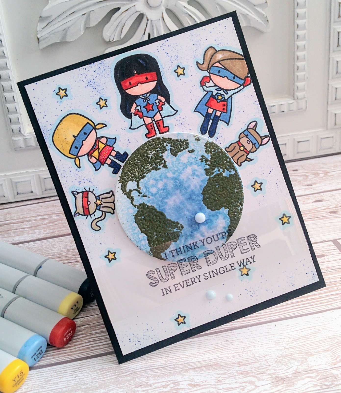
I went and saw "Wonder Woman" last night...it was such a good movie! Afterwards, I was in the mood to create a fun Superhero card. I have a few superhero stamp sets, but ultimately opted to use this sweet Mama Elephant set called "Tiny Heroes". Isn't it so cute? I bought it a few years ago when I was working on Teacher Appreciation projects!
I also used the Earth image from the "Globe Greetings" set from Concord and 9th.
The earth was created by quickly sponging some blue ink onto watercolor paper and spritzing some water on the top. After it was dry, I used some Olive embossing powder to add the green portion.
I used the coordinating die to cut the Earth out.
I created a mask using a sticky note so that I could align the cute images properly.
I stamped all of the girl heroes including the cute dog and cat images. I used Copic markers to color them. I didn't do any fancy coloring, just quick and simple.
I removed the mask and popped up the Earth image using Stampin' dimensionals. I also added some wink of Stella here and there as well as some star dust Stickles for shine. The sentiment is stamped onto a strip of acetate using black Staz On ink. I added a trio of duck eggs blue Nuvo drops around the sentiment.
I stamped the same sentiment on the inside of the card for continuity. I added some red and blue coloring to tie in the color scheme.
The shield was punched out with a circle punch and I added Stickles to that as well as the colored letters. Join me tomorrow for a new challenge from The Challenge!!
Thanks for visiting today...I have a sweet little design to share with you! As I have mentioned lately, I am trying to ink up my under-utilized stamp sets that I have had for YEARS.
When I made THIS card, I wasn't ready to put this set away, so I quickly stamped another design. I really liked the colors that I chose for the larger blooms, but decided to switch things up and bring in a cooling grayish blue. I just love the feeling that it created!
Rather than using multiple ink pads for the larger blooms, I just stamped the larger image off once before stamping on my focal panel and then used the 2nd step at full ink strength. This is one of those basic stamp tricks that I learned when I first began stamping, but it's one that never loses its pertinence. The leaves are stamped with Mint Julep ink and the shadow image is stamped in Vintage Jadeite for a great dimensional quality.
The sentiment is stamped in Palette Black ink. This is my favorite black ink because I can also use Copic markers and it won't bleed. Is there a better black ink out there that I am unaware of? I'd love to hear your thoughts on the subject. I stamped the "thinking of you" portion onto a strip of blue paper and then cut a swallow tail on the end and adhered it with foam squares.
I added a small black dot to the center of each of the blue flowers to tie in more of the black and to ground them as well. They feel empty to me without something in the center. I also added some clear Nuvo drops on the flowers and leaves to represent some dew and to create some additional shine.
I also added some Sparkling Clear sequins in varying sizes for even MORE shine! And...if that wasn't enough, I added some Wink of Stella here and there because I just couldn't resist!
The finishing touch, which I think really adds to the design, is the simple bow of Baker's Twine The entire focal panel is adhered to a piece of blue card stock and then adhered to the white card base with Scor-tape. These are the type of cards that I like having on hand, because you usually end up needing them when you least expect it. Thanks for fluttering by!