I'm back again to share yet another card from my "Vintage Cherries" card collection. It really was such a fun project to work on. This was one of my favorites...if I'm picking. There's just something about this adorable bicycle that gets me every time. It has been quite a while since I have used it and now I am really wondering why. In fact, as I was creating all of the cards in this series, it made me realize that there just aren't enough creative hours in the day! LOL! It seems like I used to experiment and work with each set in many different ways. It also seems like there are just too many cute things being released constantly and a week after it's released, it's "old". There's no way I can keep up! I buy things that I feel will stand the test of time and are classics.

Wow! That was an unexpected tangent! Ha Ha! Anyway, that's just how I feel! Now, on to the card! The design and layout of this card came to me in the night, I wasn't awake and not asleep either. Every detail was there and I was so excited to execute it. The only part that I would change would be the background pattern paper, but since I was working in the parameters of the fabric, I picked something that coordinated well.
I diecut the bicycle and stamped it using Mint Julep ink for a cute, vintage feel. I was happy to find some old SU! brads that are the exact match that I added to the spokes. The flowers are dusted with a generous amount of "Dazzling Diamonds" glitter for some sparkle.
The buildings are stamped in bright, vintage colors. The sweet shoppe and awnings were die cut and stamped as well. I wanted to give it a little more prominence and that awning is just too cute. I realized that it will get squished in transport, but it still looks really cute and the recipient will be able to fluff it back up.
The background pattern paper is from the navy and blue paper pad from The Paper Studio that I picked up at Hobby Lobby a few years ago. I used it on my secretaries day gifts that I posted a few days ago as well.
The sentiment is also from the "Pedal Pusher" stamp set and is heat embossed using silver detail embossing powder. I love the added shine and detail it gives the card.
The bicycle and sweet shoppe are adhered to the card with foam squares for some dimension. The sweet shoppe sign is also popped up.
You can see the shine on the baskets of flowers. I really like adding little details like this that offer a little something extra.
You can see the 4 cards ready to go! This was a really fun design to make!
This design was probably the one that coordinated the least, but I still feel like it "goes". Thanks for fluttering by! Follow me on Instagram @kellylunceford
I'm back today to share the second card in my Vintage Cherries card set. Before I began making the cards, I made a list of all of the stamp sets that I hoped to use that would fit in the style and overall feel of the project. I knew for SURE that "Quilted Summer" would make the list. The fact that I would be able to make red gingham paper fabric was reason enough! Ha ha!
I've only made one card with this set, which is a travesty, and I loved the chance to use it again. Too many ideas, too little time!
I die cut the quilt frame and all of the quilt triangles for each card and got to work stamping! Once again, I used all of the colors from the fabric for everything to coordinate nicely. These quilts are so much fun to assemble.
The sentiment is embossed using white powder for a nice contrast and texture. I also added some white stitching to the bottom to tie in the "quilting" theme.
I mentioned in my first post that I made 4 of each design which you can see here. The "clothes line" image was stamped in black ink and is from the "Banner Builder" set from PTI. It was the perfect size and the mini clothes pins were the perfect addition.
It looks so cute peeking out of the fabric basket. If you are interested in seeing more of the basket, you can check it out HERE. If you are interested in making one, I have made a tutorial HERE. Thanks for fluttering by! Follow me on Instagram @kellylunceford
I hadn't planned on blogging today, (I mean, I have a whole bunch of cards to share from my {Vintage Cherries} project), but when you lead a creative life, the projects have a way of finding themselves just NEEDING to be made! ha ha!My brain literally won't stop until the project is done! Thankfully this one was quick, and has already been delivered to the school secretaries!
I made THESE a few years ago and I love the paper and I still had it so that was the starting point. I also had some lanyard hardware that was itching to be used. The tags for these cute little wristlet key chains were made with "Heart Prints" and "Heart Print Sentiments" from PTI. I wanted something that had to do with keys and this was the perfect sentiment. It says "A Smile is the Key that fits the lock of everyone's heart."
I stamped the heart onto white card stock using Navy Blue ink and then the sentiment is stamped in pink.
The toppers for the nugget packages are made using the "Teach and Inspire" stamp set and is one of my all-time favorites! I Love it! It has such a great style and I love all of the sentiments.
I felt lucky to have found some fabrics at the store that worked so nicely to coordinate with everything else. I will have more information about the key chains on my other blog Thimbles and Thread.
Soap is always one of my go-to gifts because, well, everyone uses it! LOL! Or at least I hope so!!! Ha Ha! Such a fun, little gift but with a lot of charm! Thanks for fluttering by! Stay tuned for LOTS of cards coming up soon!
"I will honor Christmas in my heart...and try to keep it all the year" ~Charles Dickens
Hello and welcome to April's installment of my Keeping Christmas series! I was so happy to receive a few emails from some readers that have been participating in the "Keeping Christmas" challenge! Thank you so much for playing along! It made me so happy!
I am excited to share the project that I have been working on for this month. Back in 2001 or 2002, I made potted gifts like this for friends and family. It has been SO long, I decided it was time to re-visit the idea. It isn't any secret that I love play on words, punny gifts and coordinating themes; hence today's post "Let it grow, let it grow, let it grow."
Each pot will hold a trio of paper white narcissus or an amaryllis bulb. I won't be able to get those until it is the right season, but I am so excited to get the pots and tags done.
I had the idea of making "Christmas Tree Seed" tags last year but didn't get around to it. I am so glad that I waited and was able to use it with this gift idea.
The "Let it grow" portion was computer generated onto Always Artichoke card stock printed in black ink.
I was able to find my stash of rusty jingle bells which was the perfect addition!
I white washed 6 pots and 6 saucers and made 6 tags.
The tags were created using the "Garden Variety" stamp set and "Oh Tannenbaum" from PTI. I was so thrilled that the Christmas tree was the perfect size to peek out from the seed packet opening. If you aren't interested in making the "let it grow" portion, this is how they would look.
Before you begin, make sure that your saucer fits the top of your pots perfectly since this will be the lid for packaging. This is how the finished white washed pot will look.
To begin, get a cup of watered down white acrylic craft paint and a sponge brush. Make sure you remove the sticker from the bottom of the saucer, since this will be the lid and you will see it. I struggled getting mine off, so I had to spritz the sticker with water and rub the adhesive off with my finger. It is important to get it all off, because if you don't, the paint will adhere to the adhesive differently than the rest of the pot and you will be able to see it. Hmmm...I wonder why I know that?! Ha Ha! Make sure you paint a little bit inside the rim of the pot because you won't be putting the potting soil all the way to the top. Also, don't forget to white wash the inside of the saucer as well, because when it is in use, you will see the inside. I let mine dry while I worked on the tags.

I diecut the seed packets using the coordinating die from Garden Variety and stamped it in Palette Black in. The "Green Thumb" portion was stamped in Smokey Shadow ink as well as the sentiment at the bottom.
I made a rough measurement where the tree needed to be stamped on the white paper underneath. It gave just enough room that I could add the additonal "pot" for the tree. I fussy cut it and adhered it with foam squares. Each tag was threaded with red and white baker's twine so that it can be tied to the ribbon. I also laced a big, rusty jingle bell on as well.
This project was perfect for this time of year when you want to be planting!
I hope you will find some time to join me this month! Let me know what you make by using the hashtag #keepingchristmas on Instagram or linking your blog in the comments! It really has been so much fun and I know that I am going to have a ball this Christmas as I give all of these gifts to my loved ones! It will be like Christmas for me as I revisit each of the ideas I have shared. They are all being stored in my storage room. Thanks for fluttering by! Have a Merry April!
I promised to share the project that I have been working on earlier this week. My older kids were supposed to bring an item to auction for their youth camp fundraiser. I decided to work on two card sets and that made it so I got to play! I was worried that I wouldn't be able to make the deadline, but it was so much fun that I didn't want to stop. I made 28 cards in total, 4 each of 7 designs (2 of each design per set) which I will share the rest after my "keeping Christmas" post on the 25th of the month.
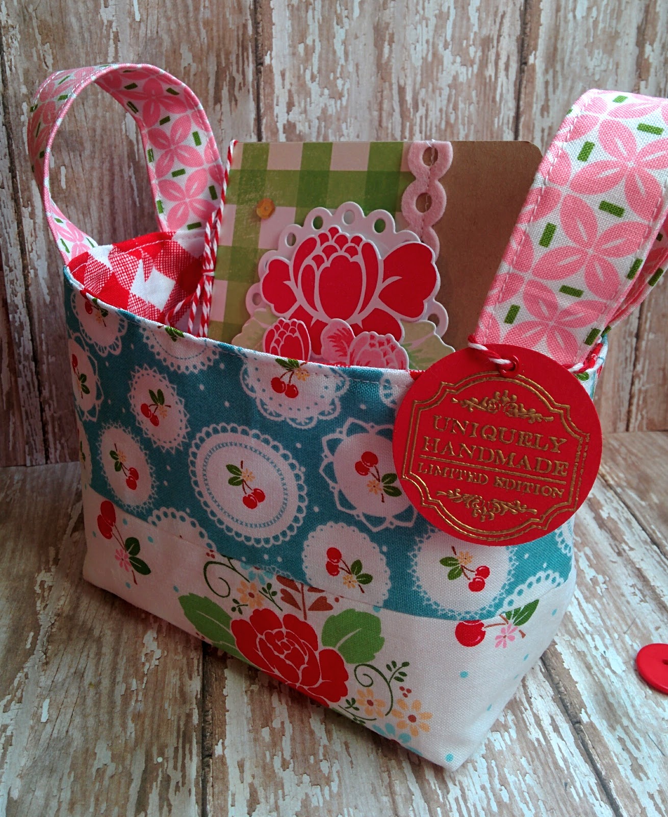
I couldn't resist this beautiful vintage cherry fabric collection. I knew it would be the perfect inspiration to create a nostalgic, vintage collection. The fabric that I have shown here, reminded me so much of the flowers in PTI's "Rosie Posie" so it was the perfect starting point.
You can see the rest of the darling fabrics worked up into the basket here. If you'd like to see more of the basket, pop over to my other blog Thimbles and Thread. There are additional photos as well as a link to the tutorial I created earlier this month.
I started the design by diecutting a circular nestabilities die that I have had for years. It reminded me of the circular pieces on the blue cherry print fabric. The flowers were die cut and stamped using coordinating inks to match the fabric choices.
The sentiment is from the last PTI release! I love all of them that came in the set and have used a few throughout the entire card set.
I diecut the felt pink border and machine stitched it down for some extra charm and detail. I used a lot of stitching, lace, buttons and twine to give it the vintage feel I was going for.
You can see all 4 of the cards here! Such fun to create! The finishing touch is a gold embossed "uniquely handmade" tag using a stamp I picked up a few years ago at Hobby Lobby. Thanks for fluttering by! Stay tuned for my "keeping Christmas" post coming up on the 25th.
I'm super excited to share the project that I am working on right now, but in the mean time I'll share the 3 cards that I made for a few of my 5 year old's friend's birthdays. Easter weekend was chock full of boy birthdays. I bought a few of the "Boy Basics" mini stamp sets from PTI YEARS ago because I knew they would come in handy as the mother of 4 boys. This first card features the skateboard set which is always fun. The skateboard "deck" was stamped using Simply Chartreuse ink onto Stamper's Select White cardstock. The wheels and trucks were heat embossed using silver powder for a more realistic look. The funnest part was diecutting the letters to spell "DUDE" out of pattern paper and adding glossy accents to the top for a professional look.

The sentiment was also heat embossed with silver powder for continuity and shine. I also did some dry embossing on the bottom panel for some added texture. A few white stars and burnished silver sequins finish it off for a fun, boyish card. This would actually work well for a teen as well.
I got a bit creative with this second design. I'll see if you can guess what the theme of the party was.....hmmmmm...let's see; repeated cloud pattern, purple green and white, "To Infinity and Beyond"....that's right! Toy Story! I also included the new sentiment from PTI's "Simple sentiments: Friendship" which says "You've got a friend in me". How perfect is that? I added it to the inside but didn't take a picture.
The space ship was diecut and stamped using Palette Black ink and then colored using Copic markers. I added some Stardust Stickles here and there for a fun galactic feel. The sentiment was heat embossed using silver powder.
The sun burst design was stamped in blue over the top of the clouds to give it a more dynamic feel. The stars and moon were diecut and colored as well and then added using foam squares. This one might not be the prettiest or cutest card in the world, but it was so fun to design.
Last but not least, the sports card! This one is clean and crisp with a few fun details to make it pop! I really like the foam cork that I used as a background for the pennant detail. I absolutely love this realistic football texture paper. It totally makes the card with minimal effort. A little bit of gold embossing add some shine.
I added some machine stitching to anchor all of the layers and I love using it as a detail on many of my sports designs. I love the craftsmanship of sports equipment. Lots of stitching, lacing and leather work.
I added a length of black twine for some contrast and a tiny clothespin for added detail.
I really wanted to use the jersey image but felt it would be too cluttered on the front. It worked well for me to add the "Future Hall of Famer" sentiment to the inside! Thanks for fluttering by! Join me soon as I post what I'm currently working on and don't forget to join me on the 25th for this month's "Keeping Christmas" segment.