Thursday, August 24, 2017

Verve's 10th Anni-verve-sary Blog Hop-Little Ones

Welcome to my blog! I am SO excited to be a guest designer for this amazing milestone and I'm so proud of Julee! She is so amazing! She has always been such an inspiration to me! Now that you're here, you can find out about all of the the festivities below! You should have arrived here from Christyne's Blog. I have LOTS of cards using this adorable new set so make sure to scroll to the end! I was just having so much fun! 
                                                 Verve Stamps August 2017 Spotlight Hops
Welcome to our 10th Anni-VERVE-sary Spotlight Hops! Verve is celebrating 10 years of bringing stamps to the world with a release of new and classic Verve! For the next few days we'll be shining our creative spotlights on the new Verve sets and dies that will be releasing Monday, August 28. We hope you'll join us as the design team, special Guest Diva Kelly Lunceford, and some fabulous rockstar alumni Divas share their inspirations with the new goodies this week.
Today's feature is on the Little Ones stamp set and coordinating Little Ones Die Set. A fusion of old and new, this baby themed set brings back some of Verve's most popular plain janes, mixed with a few new designs to tie it all together.
Want to win some shiny new Verve? We'll be picking a random commenter on one of the hop spots below to win today's featured products! Leave a little shout out in the comments section on all the blogs below to increase your chances! Check out the Verve Blog today for the full hop list, a little more about our new products and all the prize info and deadlines!

Little OnesLittle Ones Die Set


Day 1 Hop List
1. Julee5. Marisa
2. Maureen6. Lesley
3. Betty7. Christyne
4. Charmaine8. Kelly (Guest)


 Julee is the queen of amazing sentiments and it's easy to make them the star of the show and in this case, figuratively and literally! Isn't this star sentiment the best? I chose to create a celestial looking watercolored background but kept it simple so the sentiment would pop! The background is created by using 140lb. watercolor paper and then I used THESE to create the background.
The sentiment is heat embossed using gold powder on Kraft paper and then diecut and adhered to the card. I also added a vellum strip to the center for some visual interest. A few sequins finish up this simple, yet striking design. This sentiment is perfect for more than just baby cards, too~ Everyone needs to know that they're loved on a regular basis, right?
Next up is a fun little design using the heart and chickie stamp and coordinating die cuts. I was having so much fun blending, I thought it might be fun to blend a blue sky for this little chikie to fly away...or is it a duck? LOL!  The blended background is also spritzed with some shimmer spray for shine. I love the way it reacts with distress inks and oxide inks.The duck/chick is colored using Copic Markers. I stamped and die cut the hearts and used them as balloons. They also have a generous amount of Nuvo Glaze as well so they are shiny like balloons. 


I temporarily placed the chick and hearts into place so that I could draw some black balloon strings using a black marker. Once that was done, I was able to place everything permanently onto the card using foam squares. The sentiment is heat embossed in silver and a few sequins for some shine finish it off.


My next card incoporates the cute rattle image and coordinating die cuts which are linked in the intro above. These will all be available for purchase on the 28th. To begin, I blended some Spun Sugar Distress Ink onto some Bristol paper for a nice smooth blend. I concentrated the most saturated color in the middle of the panel so the eye would be pulled to the sentiment. I


The sentiment is stamped in gray ink for a soft feel. I stamped and colored a bunch of the rattle images, very simply, and then used the coordinating die cuts to cut them out. I also added some Nuvo Glaze over the top of each one and let them dry. I have not used any Glossy Accents since I purchased the glaze. I love that the tip doesn't clog and is ready to go! It has a much faster flow, which I mentioned in an earlier post, so it has a learning curve.

I die cut the blended panel using an edger die and then added the rattles using foam squares. I cut the overhanging bits using scissors following the edges and curve of the paper. This focal piece is adhered to a Soft Stone piece of cardstock. The "congrats" sentiment, which is also included in the set, is heat embossed in Silver. The trio of silver Nuvo drops finish the design.

The last card is quick and fun using a unique sentiment. I just love that Julee thought of something for the grandparents. My son's teacher is expecting a new grandbaby in a few weeks so I am excited to give this to her with a little baby gift.  The circle portion is blended as well (shocker) and the sentiment is stamped in black. I also added some nuvo glaze to the the banner portion for some shine. I like how it made the color look more intense in this area as well.
The rattle is colored and cut and then I added a generous  amount of Wink Of Stella as well as Nuvo Glaze.  The little star image that I used is from another new set that will be showcased in the next few days. The yellow portion is dry embossed using the knitted embossing folder from Richard Garay. I liked how it seemed like a baby's blanket. I used my MISTI for exact placement of the "congrats" sentiment. A bow of black baker's twine finishes it off. Join me tomorrow for MORE new samples using the new sets!! Thanks for fluttering by!

Sunday, August 20, 2017

You make this world better!

I've got a couple of cards to share with you today. My daughter has been getting after me because we don't have ANY masculine cards for her to take to school for the Hope Squad. I thought this blue card with the globe seemed masculine, but my daughter informed me that the heart made that idea null and void! ha ha! Oh well...I tried! I decided to make the next attempt plain and simple. She said it was good, so yay!(scroll down to see that one)
I actually made this card for THIS challenge, but it ended up by not working because I added the silver so I decided to save it to share later. I didn't anticipate it being THIS much later! 
I used Concord and 9th's Globe Greetings Bundle for this card. It is becoming a fast favorite! I just love how many different kinds of cards you can make with it. The background was created by watercoloring a piece of 140 lb cold pressed watercolor paper using Zig Gansai Tambi Kuretake Pearl Watercolors and then ran it through my cuttlebug for a fabulous dry embossed effect. You can see a few other examples of this on THIS card, THIS card and THIS card. It really just changes the whole look of the watercolor paper! It is a very fun and addicting technique. The heart was left over from the second card I linked above. It has been so nice having left over pieces to add to different cards here and there.
This card is very simple in design and execution for a nice masculine result. I used the You are Loved stamp set for this card, and this set was the inspiration for the entire project that my daughter and I are working on. I chose to create a background using several of the included images. 


I placed all of the images together onto an acrylic block so that I could just stamp one row at a time. It worked out so nicely that way and went very quickly! Once that was done, I was able to color the stars and the world images using Copic Markers.


I also added some Wink of Stella over the top of the world images for some shine. The sentiment strip is heat embossed using white powder onto black paper. Also, I DID add some Nuvo Crystal Glaze after the fact and it looks incredible! I added it after I took the pictures. Oh well! Super simple but hopefully the boys will like it! Thanks for fluttering by!

Saturday, August 19, 2017

Inking about you!

I mentioned earlier that I have a stack of cards to photograph. I finally got it done and I am ready to share them. This is the last of my "water park" inspiration cards. LOL! I think I am FINALLY ready to move on and make some Fall cards. We've had a few "coolish" days that have me thinking Autumn thoughts and the kids are headed to school on Wednesday. I'm glad we've had a fun summer without any regrets! 
This particular color scheme and blocking was inspired by a pair of swim trunks. I really liked the colors and the proportions...I thought it would make a nice card. I absolutely love this little octopus image from the Seaside stamp set from Reverse Confetti. The sentiment is so cute as well! This particular design will be added to the stack that will be headed to my daughter's school for the Hope squad.
To begin, I figured out the measurements of the different pieces of cardstock and adhered them to an A2 white card base. I also die cut a white circle using a nestabilities die and dry embossed it with an old Cuttlebug embossing folder. I just love the bubbly effect it gives the card. The sentiment is heat embossed in white onto a strip of vellum and adhered to the card using some adhesive behind the turquoise octopus. 
Each octopus is stamped and die cut using the coordinating Seaside Confetti Cuts. I also wanted to add some extra detail with some white Nuvo Drops. Unfortunately, they picked up the color of ink that they were stamped on so they have a tone on tone effect, rather than white, but I still like the result. 


I added the die cut pieces to the card using foam squares and then added a few more Turquoise Nuvo Drops for some extra detail! I also added some Sparkling Clear sequins to finish it off. Super easy and fun! Thanks for fluttering by!

Thursday, August 17, 2017

Coloring with stencils; two ways

I picked up a few new stencils for myself for my birthday and I had some time to play around with them last week. I intended to only make one card, which is the first one I will be showcasing, but I wanted to do some comparisons with the result by using Distress Oxide ink as well.
This is the first example that I watercolored. I knew going in that it would be a loose, organic watercolor rather than crisp and tight like the stencil. I know that I would need to use some spray adhesive on the stencil to keep it clean looking, but that isn't the feel I wanted to create. I used THESE watercolors. They have beautiful colors and are very creamy. I used to only use the liquid watercolors, but I really like using these ones as well.
To begin, I taped the Bold Floral Stencil over a piece of 140 lb. cold pressed watercolor paper and begin filling in the negative space with green paint. I was mostly focusing on the areas with leaves. I came back in with a beautiful blue color for an earthy feel. I really like the color combination. I did add some gold here and there for contrast.


I removed the stencil and went back in with a wet brush and smoothed and defined some of the lines a little better. This was very fun for me because it felt more natural, rather than following a "Pattern" so to speak. The I really didn't have a plan for the watercolor panel once I was done, so I added a quick and simple die cut and heat embossed sentiment to a strip of Kraft cardstock. I used the Scripted stamp set and coordinating dies.  I used the same technique as I did for THIS card if you're interested in reading more about it.
Once I was done with that card, I wanted to compare and contrast by using the same stencil but using Distress Oxide inks instead. As you can see, the results are much softer and have a completely different feel, even though I used the same stencil and colors.
I tried to very carefully only sponge the flower areas blue and the leaf areas green, but you can see where there was some overlap.
This die cut sentiment is from a set I bought a few years ago and I don't remember the manufacturer to link it. I stacked it in the same way I did on the previous card, but decided to add some Glossy Accents as well for some shine. The "dearest friend" sentiment is from the "Scripted" set as well. I've linked it in the previous card. Thanks for fluttering by!

Monday, August 14, 2017

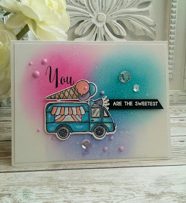
Color Throwdown #455-You are the Sweetest!

I just couldn't resist making something for this week's Color Throwdown Challenge. I also couldn't help but making an ice-cream card as well using the new Summer Swirls stamp set from Altenew that I got a few weeks ago. It was the perfect set for these sweet, summery colors!


To begin, I sponged some distress inks onto a piece of Bristol paper for a smooth blend. I wanted to recreate the look of three scoops of ice-cream to mimic the look of the cone on top of the ice-cream truck. Once that was done, I spritzed it with some water and some shimmer spray. I really like how it looks sugary and sweet! I set it aside to dry so that I could work on the rest of the card elements.
I colored the truck and the  ice cream cone on top using Copic Markers and a little Wink Of Stella for some added shine. The windows on the truck have some Nuvo Crystal Glaze to make them look realistic. I normally would use Glossy Accents, but I was wanting to try the glaze to see how it compares. Here is my result; the crystal glaze is much thinner in consistency than Glossy accents. It says to test before use, which I ignored the first time I used it and regretted it. It feels different so it is important to "test first". Ha Ha!I diecut the colored images using the Summer Swirls Die Set.
I adhered the focal panel to an A2 card base and then stamped the "you" sentiment using Palette Black ink. I thne added the die cut pieces using foam squares. The black sentiment strip was added using foam squares as well. I heat embossed it using white powder for a nice pop.


I sponged the same colors onto one of the ice cream cone images for the inside. 


I added some Raspberry Pink Nuvo Drops here and there as well as a trio of Sparkling Clear Sequins. Thanks for fluttering by!

P.S. I have a STACK of cards that need to be photographed as well as a few fun teacher projects I have been working on. I also got a STACK of new stamps to play with as well. 

Thursday, August 10, 2017

Teachers make the world a better place!

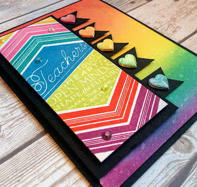
I've been busy as a little bee collecting all kinds of wonderful Back-to-School gifts for my boys' teachers this year. The dollar section at Target had a fabulous selection of rainbow teacher school supplies that I picked up! I knew that I HAD to make some fabulous rainbow cards to match everything! This card was originally made for The Challenge, but with sadness, last week was the last challenge! Sniff, sniff! I had so much fun participating and being part of a team again! I wish Lesley all the best as she juggles her creative life and taking care of her adorable, sweet new baby! If anyone understands needing to minimize, it is me!
My generous sister gave me the entire collection of the new Distress Oxide inks for my birthday and I was DYING to get inky. I had to wait because of other commitments which was torture, but I FINALLY got a chance to play! The challenge was a sketch challenge, so that is what all of the layers and tabs reflect. To begin, I started with the ever amazing and useful Teach and Inspire stamp set from PTI. I absolutely love it and use it ALL THE TIME! I created a rainbow of colors, but not in rainbow order on the focal panel. I wanted to give it a whimsical and fun feel. I just love how the chevron image looks like a book being opened. I gave it a light spritz or two of Shimmer Spray. After that was all dry, I mounted it onto a panel of True Black Cardstock to make it all POP!
I added a few Rainbow Sparkle Jewels here and there on a few of the different color sections for some added sparkle and shine. I am seriously in love with them, as those of you who visit often already know!
The heart embellishments on the "tabs" are leftovers from THIS card and they worked out so well on this card. I added some Glossy Accents because it just looks amazing and adds even MORE shine! If you're interested in how I made them, check out the card that I linked earlier.
I was loving the new colors of Distress Oxide inks so much that I decided to create a coordinating blended background. I used the same colors as I did in the focal panel, but this time in rainbow order. The colors I used are: Candied Apple, Fossilized Amber, Spiced Marmalade, Twisted Citron, Peacock Feathers, (Salty Ocean in the focal panel) and Picked Raspberry. After I had blended the background, I spritzed it with water and shimmer spray for optimum oxidization.
I hadn't planned on so much black, but it really made sense to mount it all onto an A2 card base to frame all of the other black layers. I think this design will coordinating perfectly with the gift baskets that I have put together for the teachers. Thanks for fluttering by!

Tuesday, August 8, 2017

It's a good day to be HAPPY!

 Today is overcast and a little rain here and there so I thought I would share something bright and tropical! I got these amazing palm frond die cuts at Hobby Lobby a week or so ago and they have just been waiting for me to use them. I thought they paired nicely with the Some like it hot stamp set. I don't have any other tropical flora and fauna sets so I was excited to add these to my stash.
 To begin, I die cut a large oval window from a sheet of Stamper's Select White Cardrstock and then used the woodgrain impression plate to create the texture for the rest of the panel. After that was done, I sponged some Broken China distress oxide ink onto an A2 card base using the oval opening from the woodgrain piece as a reference for size. I spritzed it with some water and Shimmer Spray Sprtiz for some shine. 
 The palm fronds are cut from Simply Chartreuse cardstock with a little bit of Simply Chartreuse Ink sponged on the edges for some contrast. These were also doused with a spritz or two of shimmer spray. Once that was all done, I left everything to dry and started working on the hibiscus flowers and other die cut pieces. The "happy birthday" sentiment comes from the Happiness in Bloom stamp set and I really thought the fonts complemented the overall feel of the design nicely. I heat embossed it onto the blue sponged portion of the card base using gold embossing powder. It did warp the card a little bit so I ran it through my cuttlebug to flatten it out again.
I added some Wink of Stella to the flowers to bring in some added shine. 


 The white oval panel is attached to the A2 card base using foam squares and then I began building the scene around it. The finishing touch is a generous dose of Bright Gold Nuvo Drops here and there. I had so much fun using them on THIS card, I thought I could create a similar effect.


I decided to put the oval piece that was cut from the focal panel to good use and create a sentiment for the inside. I used the "Happiness In Bloom" set again but this time with a different sentiment and mixed black ink and gold embossing. I like how it turned out. Thanks for fluttering by!