Showing posts with label Altenew. Show all posts

Friday, June 26, 2020

Pinkfresh Studio + Altenew “Celebrate” Collaboration Blog Hop Details + Giveaway

I'm beyond thrilled to be here today for the Pinkfresh Studio + Altenew "Celebration" Collaboration Blog Hop! We're showcasing two beautiful new collaboration sets between these two amazing companies! Pinkfresh Studio will be giving the entire release to one lucky winner on their Facebook page so make sure to go there as well! Also, leave a comment here to be eligible to win a $15 dollar gift certificate to the Pinkfresh Studio shop!


You are invited to the Inlinkz link party!
Click here to enter

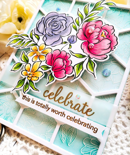
I've got two cards to share with you today using each of the new sets being released today! They are both so beautiful and I had so much fun creating with them! Up first is the blue floral card using a lot of my current favorite things!

I've really been on an emboss resist kick lately, especially with the beautiful background stamps from Pinkfresh Studio! For this card, I heat embossed the Enchanted Blooms background stamp onto a 4 1/4 by 5 1/2 inch panel of white cardstock using white detail embossing powder. Once that was done, I added some Ocean Breeze and Mermaid Cove ink using a blender brush. 

I die cut the Simply Hexagons die four times out of heavyweight white cardstock and glued them together using liquid glue. I adhered it to the top of the embossed panel using additional liquid glue. I set that aside and got to work on the beautiful flowers!

I stamped the flower from the new Celebrate Today stamp set with black ink and then colored the image using an assortment of alcohol markers in bright, summery colors!

I used the coordinating Celebrate Today die to cut it out. I used stacked foam squares to adhere it to the embossed background for optimal dimension!

This gorgeous stamp set comes with some fun sentiment options! I chose to pair the "celebrate" sentiment with the "this is totally worth celebrating" sentiment. I just love it and it works for so many different occasions. It's perfect to add to your stash for either a wedding, graduation, birthday, accomplishment, or milestone!

Both sentiments are heat embossed in gold with the "celebrate" being embossed onto a strip of lightweight vellum. The other one is just embossed onto a strip of white cardstock and then popped up with foam squares underneath the strip of vellum!

I added some colorful Essentials Jewels here and there on the background and flowers. I used matching colors to give the card some extra sparkle and detail.

I like to use varying sizes of jewels here and there to give the card balance. This was such a fun card to work on and such a gorgeous floral image to color!

My second card is bursting with summer cheer! Once again, I heat embossed the Enchanted Blooms background stamp and then added two different colors of ink for a colorful background. The lemon/lime colors make me happy!

I die cut the embossed panel using the Essentials Stitched Rectangles and added the panel to a top folding A2 card base using foam squares.

I also added the beautiful Ornate Oval Frame using additional foam squares. It's the perfect frame for the gorgeous flower from the new Celebrate Us stamp set. This is a multi step stamp that is so easy to use with such beautiful results.

I stamped it in black and then added the different colors using each of the different stamps. I love multi step stamping and this one is super easy to use! I used the coordinating Celebrate Us die set to die cut the flower.

I placed it in the middle of the frame using foam squares and then got to work on the sentiments. 
I die cut the "thankful" portion of the sentiment out of black cardstock and the shadow from white cardstock for some nice contrast. I glued them together with liquid glue and popped it up on the flower with some foam squares. The "for you" portion is simply stamped onto a strip of white cardstock using black ink and then added underneath the flower.

A few jewels finish off this colorful design! I had such a fun time creating both of these cards! These are two sets that are hard to put down! Thanks for joining me today and thanks for fluttering by!

Friday, March 23, 2018

You're in my thoughts today!

I have a list of projects I SHOULD be working on, but when you feel like a friend could use some cheering up, plans change!  I probably (most likely) already have a card in my stash that would work nicely to send  her, but where's the fun in that?!? 

I will apologize up front for not using links for the products I used....my 4 year old spilled water on the computer keyboard and it's totally wonky! So..I've been forced to use my phone. I will add the link for the Window Works Die since I've had a few questions about it. 

The sentiment is embossed in Altenew Rose Gold powder. I also added it to the details on the leaves. I also used the Beautiful Day stamps and dies from Altenew. It's been a while since I've used it and I recently got the dies so it was excited to use it. Thanks for fluttering by!


Monday, January 8, 2018

Merry Monday #272 Have a holly jolly Christmas!


Welcome to the second Merry Monday Christmas challenge of the year! It's  been feeling strange to me that I am making new cards as I am busy trying to get Christmas all put away! LOL! This is the longest that it has EVER been up, but I am trying to take my time and get everything put away properly. Every year I miss a few things here and there and I just shove them under the stairs for me to stare at all year long! Ha Ha!
This week, Leanne asked us to create a card with glasses. I don't own any stamp sets with glasses, however, so mugs will just have to do! Ha ha!


I had so much fun making THIS card last year, so I was happy to get to use Cup of Cheer and the coordinating DIE. I've been using a lot of the same color combinations so I decided to go back to a traditional Christmas color palette, but with a pop of pink for some interest. To begin, I blended a 4 by 5 1/4 inch piece of white cardstock using Peeled Paint Distress Oxide Ink. I wanted a green that would complement the pink and I think this is just the ticket. I also spritzed it heavily with some Frost Shimmer Spray. I really like how it reacted with the oxide ink. I set that aside to dry and got to work on the sentiment and the cups/saucers/teapot.
I diecut quite a few of each image because I knew I wanted to stack them here and there for a strong presence, since that was the point of the challenge! Ha ha! I stamped them in a combination of pink, red and the foliage in the same Peeled Paint oxide ink as the background for a perfect match.

The sentiment is heat embossed using one of my favorite new embossin powders; Rose Gold by Altenew. I thought the Rose Gold would look nice against the pink and I was right! The sentiment panel is attached to the blended panel using foam squares for some dimension. I also added a few Sparkling Clear Sequins here and there using Tombow Multi Medium Matte and my Jewel Picker.

\
The cups, poinsettias and tea pot are stacked and scattered here and there for a fun and whimsical card! I also added a few drops of Bright Gold Nuvo Drops in the center of each poinsettia for some added gold detail and shine.

I had quite a few cups and flowers left over so I decided to add them to the inside with a "cup" sentiment. I think this set is so cute and I love all of the sentiments, but this is one of my favorites! I hope you'll get a chance to play along! Thanks for fluttering by!

Monday, August 14, 2017

Color Throwdown #455-You are the Sweetest!

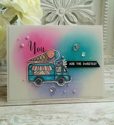
I just couldn't resist making something for this week's Color Throwdown Challenge. I also couldn't help but making an ice-cream card as well using the new Summer Swirls stamp set from Altenew that I got a few weeks ago. It was the perfect set for these sweet, summery colors!


To begin, I sponged some distress inks onto a piece of Bristol paper for a smooth blend. I wanted to recreate the look of three scoops of ice-cream to mimic the look of the cone on top of the ice-cream truck. Once that was done, I spritzed it with some water and some shimmer spray. I really like how it looks sugary and sweet! I set it aside to dry so that I could work on the rest of the card elements.
I colored the truck and the  ice cream cone on top using Copic Markers and a little Wink Of Stella for some added shine. The windows on the truck have some Nuvo Crystal Glaze to make them look realistic. I normally would use Glossy Accents, but I was wanting to try the glaze to see how it compares. Here is my result; the crystal glaze is much thinner in consistency than Glossy accents. It says to test before use, which I ignored the first time I used it and regretted it. It feels different so it is important to "test first". Ha Ha!I diecut the colored images using the Summer Swirls Die Set.
I adhered the focal panel to an A2 card base and then stamped the "you" sentiment using Palette Black ink. I thne added the die cut pieces using foam squares. The black sentiment strip was added using foam squares as well. I heat embossed it using white powder for a nice pop.


I sponged the same colors onto one of the ice cream cone images for the inside. 


I added some Raspberry Pink Nuvo Drops here and there as well as a trio of Sparkling Clear Sequins. Thanks for fluttering by!

P.S. I have a STACK of cards that need to be photographed as well as a few fun teacher projects I have been working on. I also got a STACK of new stamps to play with as well. 

Monday, July 17, 2017

Wish you the most beautiful day!

 Hello! I hope you all are having the most beautiful day! I had some time to kill the other day while I was waiting for my daughter's dance class to end so I decided to try my hand at the "no line watercoloring" technique. I have been playing around with the Beautiful Day stamp set in the last few days. I experimented with some Copic markers on a card which I will be sharing soon. The first time I used the set I opted to use the solid images which you can see HERE. I just love the versatility that you can achieve with each of the different types of images. I love it when I can stretch a stamp set!


 Because I was just experimenting, I did some simple stamping with a reliable layout. I was really just hoping to get something that I could make into a card if it turned out.


You can see some of the shading that I did here in this photo. I haven't done a lot of researching on the subject, but I think that most people just use one shade of color and blend it out. I decided to make things difficult and use three. I will try only using one next time. 


To begin, I taped my watercolor paper onto my grid paper and stamped the images using Vintage Photo Distress ink. I did some masking so that I could have a nice end result...if I made it that far. (wink) I chose two different aqua painter pens; a fine tip and a regular tip and in the end, I ONLY used the fine tip. I liked the control I had while working!


 You can see my process here. It really is so fun and relaxing to sit and work on a project like this. Four flowers was a lot of work, especially for my first time and I did find myself getting lazy toward the end. Shame on me! I actually like the way this looks over my finished card, so I am thinking that less is more in this case. I can't wait to try it again!
 Once I was finished with the flowers, I moved on to the leaves opting for three colors for these as well. The shading on them really does create some movement where their outline images gives none. That is really when you see the magic...once they start to come alive as the water and paint hit the image.
 At this point, I was just so happy that it actually worked, so I chose to add a simple strip of vellum with the sentiment stamped in black. I also added a few sequins as well as some Morning Dew Nuvo drops here and there on the flowers as well as the leaves. I made them small and realistic looking. I added some to the card I made using Copic markers and I made them bigger and more of an embellishment rather than a realistic looking dew drop. Like I mentioned, this was fun and I can't wait to try this more often so that I can get better and better. Thanks for fluttering by!


Thursday, July 6, 2017

The Challenge #90 Hugs and Happy thoughts

I am completely in LOVE with this week's challenge photo! I had SO much fun putting this week's card together! You can check out all of the details HERE and you can see what all of the other design team members came up with as well 
Image may contain: people sitting
I would be pleased as punch if this chair were in my home! It is absolutely gorgeous and the perfect starting point for a fabulous floral card! It reminded me so much of THIS card that I made a few years ago so I wanted to use some new floral images for today's design.

My starting point was this fabulous set called Beautiful Day which has images similar to the floral images used in the textile on the chair. It has the perfect balance of leaves, florals and sprigs of greenery to create something similar. As you can see, I took a very literal approach for my design. 
To begin I took some time out to create masks for each of the large images so that I could build a fabulous floral scene. I had so much fun placing things here and there. The new To the point edgers dies arrived while I was away with my husband so I was excited to use them on this design.I thought the way I used the scalloped die made it seem like the top of the chair, which you can't see in the photo, but I used my imagination.


I used a mixture of solid images as well as the line art images that are included in the set. I like the mix and I feel as though it works well to recreate a textile look. The line art images are colored using Copic Markers and the solid images are stamped in a variety of ink colors for maximum definition.
The sentiment is heat embossed using white powder onto a black strip of cardstock. I added a few sparkling clear sequins here and there. After all of that was done, I adhered the focal image onto a piece of black and white striped paper using foam squares. I adhered all of that onto a black card base. I really went back and forth between a white or black base. I liked the white better, but ultimately, the black won because the frame of the chair looks so stark against the fabric and the black had the same effect. Thanks for fluttering by!