Showing posts with label boy designs. Show all posts

Thursday, March 11, 2021

Thanks For a Great Season, Coach!


Hello friends! This is another one of those "more for me" posts so I can document certain projects, etc! ha ha! My 3 youngest sons have been playing city ball with the recreation department and the season is winding to a close. That can only mean ONE thing; coach thank you gifts!

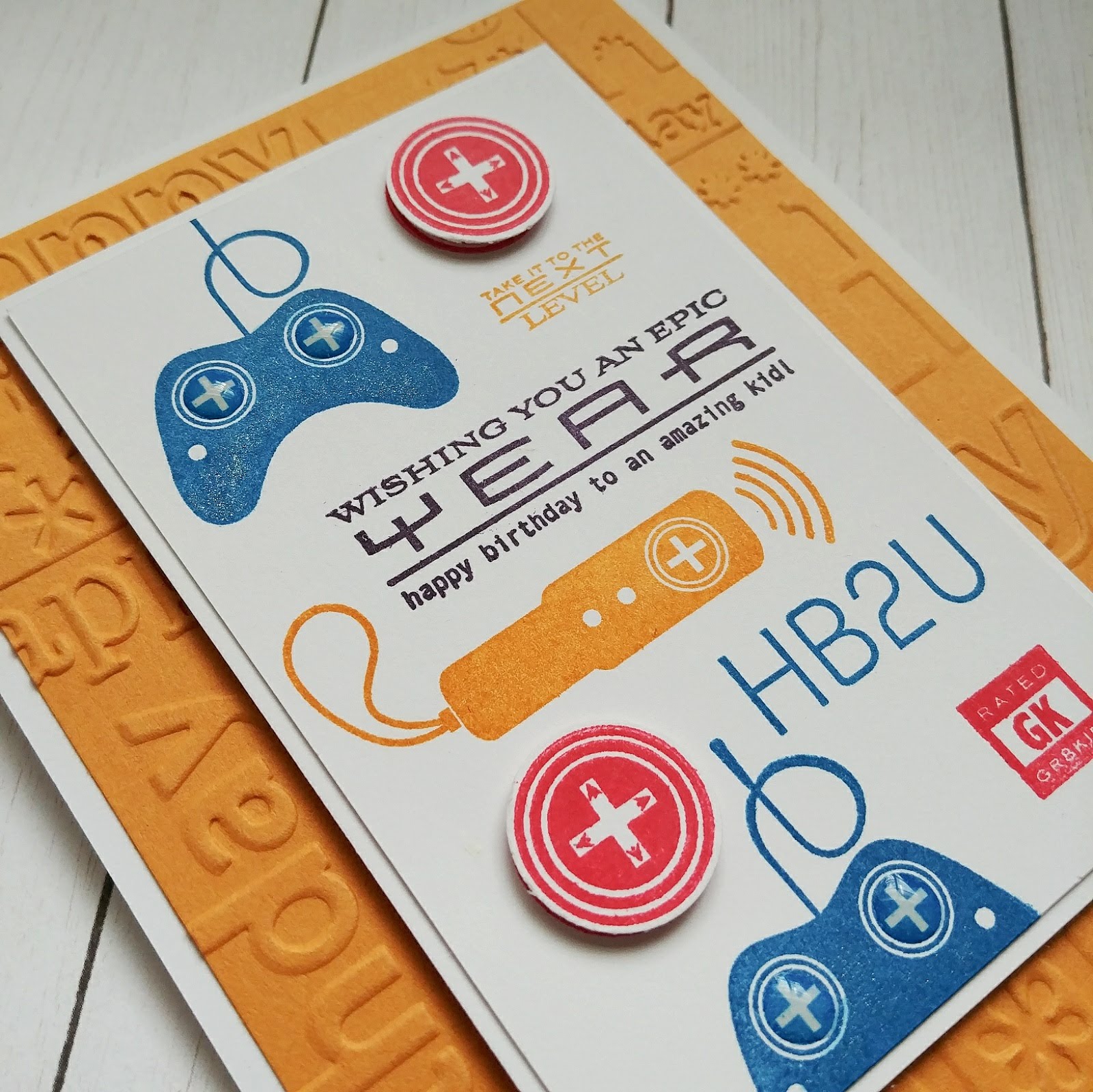
My husband is the coach for my 7 year old and has an assistant. My husband ALSO coaches my 11 year old and has the SAME assistant! LOL! I thought that was so funny! Anyway, my husband wanted to give the assistant a thank you gift so I got to work. I showed him the projects I made two years ago, but he said the colors were all wrong! I'll let you decide if they're "all wrong" or if they're exactly the same.LOL! You can see them HERE. He wanted the card to look like the current Utah Jazz "Dark Mode" jersey! You can take a peek at that HERE.

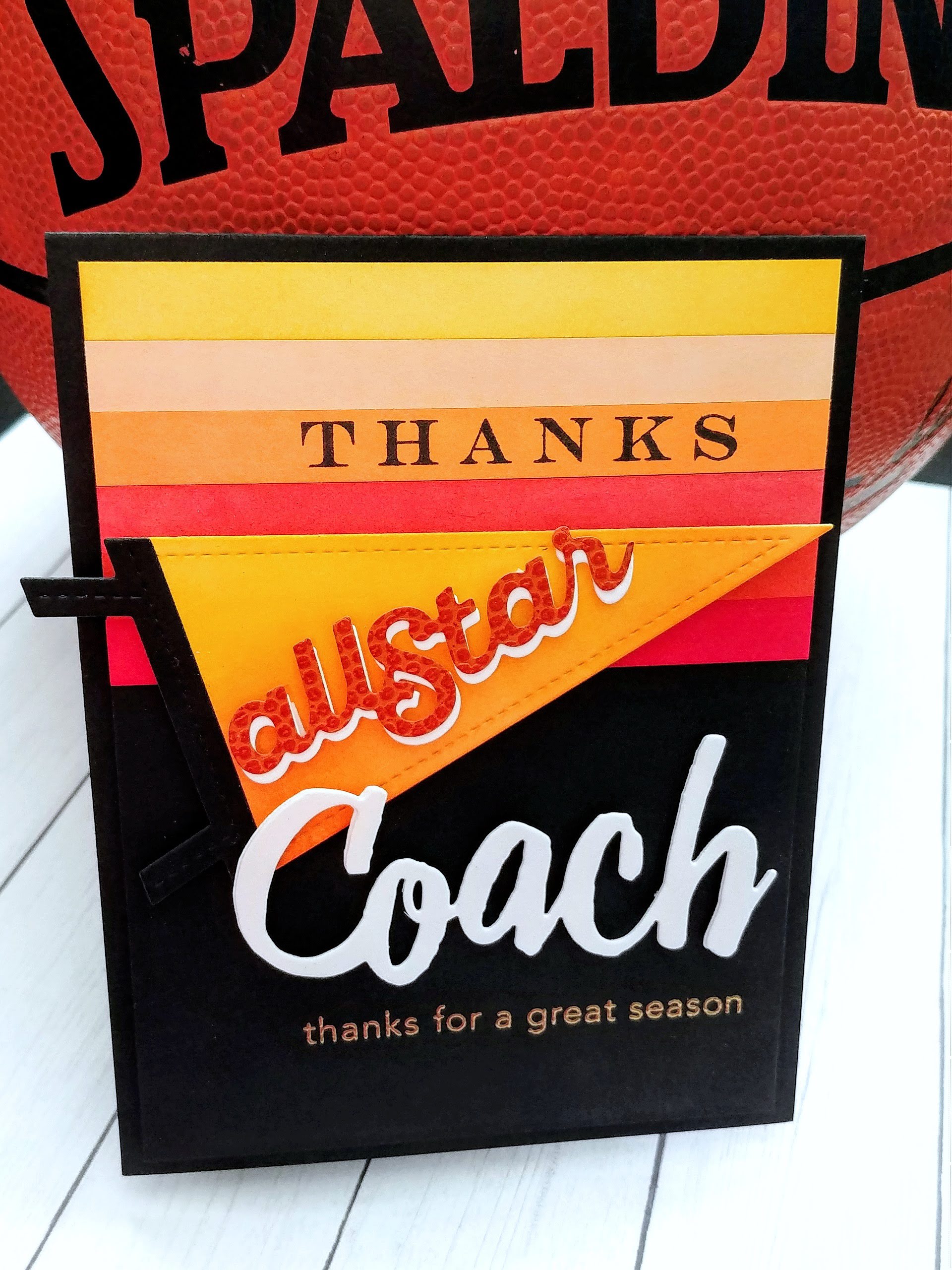
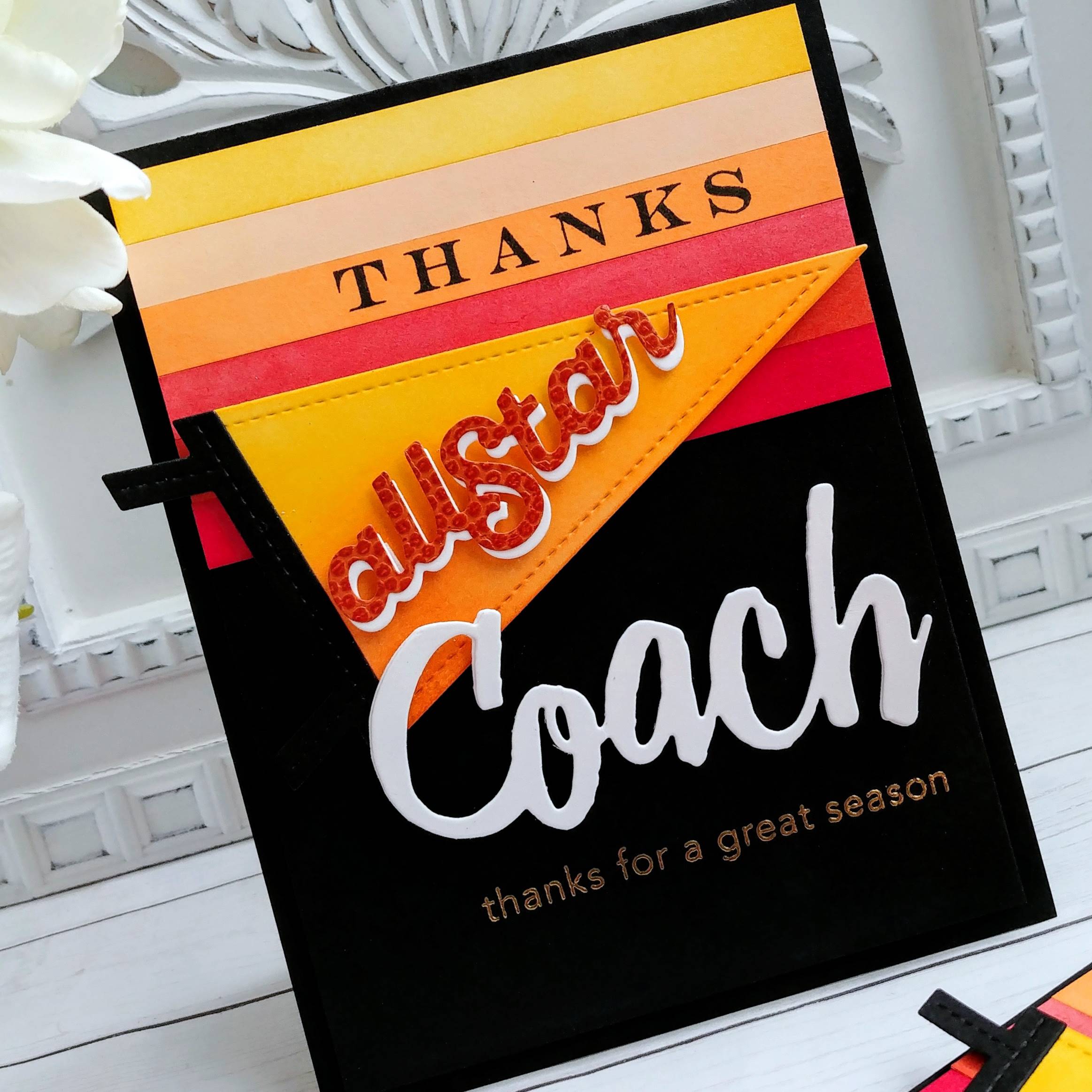
So, here you have it! The Utah Jazz Dark Mode Jersey inspired card! I made two because my 9 year old will be ending his season this week with a double header and we wanted to thank his coach as well!  To begin, I cut strips of white cardstock and then did a direct to paper inking to color the strips with the right colors. I simply swiped the juicy ink pad along the strips and applied the ink. Once that was done, I added them to a black panel measuring 4 by 5 1/4 inches using a tape runner.
I went ahead and stamped the "thanks" onto one of the strips using the retired "Thanks, Coach" stamp set. In hindsight, I would have stamped it directly across the middle of the strip, but I had mentally planned out the layout and didn't actually try it out first! Oh well! I used the Thanks, Coach die to die cut the "coach" word twice for each card. I glued them together using liquid glue.


The "all Star" portion of the card was created using the Pennant Flag dies. I love using specialty paper to tie in the theme of the card, so in this case I used basketball texture paper. I only have one small scrap left so it looks I'll be needing to buy some more before next year! ha ha! Especially since I'll be making this same card again but in "different" colors! LOL! Am I being snarky today, or what? (hangs head in shame)

I heat embossed the "thanks for a great season" sentiment directly onto the panel using gold powder. I layered this entire panel onto a top folding A2 card base using foam squares. I added a white panel on the inside using additional sentiments. These were fun to make and I think the coaches will like them! Thanks for fluttering by!


Tuesday, August 4, 2020

You're not old, you're a classic!


It's always a good day when I get to use the Greatest Hits stamp set and Greatest Hits SugarCuts! I have two male birthdays coming up and this is the PERFECT stamp/die set for them.  It is one of my favorite sets and it's so much fun to play with!

I also paired it with the Musical Cover Plate which I dry embossed on the Aqua Mist panel. I placed the record right in the middle using foam squares. From there, I added the rest of the records using additional foam squares and liquid glue. I trimmed the one in the upper right hand corner with scissors to make it fit the panel.

I went a little crazy with the white colored pencil to give the illusion of shiny vinyl, but I really do love the effect! The record player needle arm is die cut out of silver specialty paper. I added a silver brad in the die cut hole and then trimmed the extra prong portion off with wire snips.

The sentiment is heat embossed in silver onto a strip of red cardstock. I wrapped it around the corner of the card diagonally for some fun detail. I used to use this design detail a lot, but have fallen out of the habit! It's always fun to bring old techniques back into the rotation.

I stamped the "Happy Birthday" sentiment at the bottom using my mini MISTI and black ink!

Each panel is added to a red card base using foam squares for added dimension. I also added a trio of sparkling clear sequins for detail and shine. Even though these are male cards, I think for the look and feel of these cards, it works! I forgot to photograph the inside, but I added the "Hope your birthday is a hit" sentiment and another record. Thanks for fluttering by!

Tuesday, July 28, 2020

It's Cake-Chomping Time! and a WINNER!!!

Thank you so much for ALL of your comments on my Keeping Christmas giveaway post! You are all so sweet and I love that you share my same enthusiasm for Downton Abbey AND The Greetery! I have two cards to share with you today, but I'm sure you're all anxious to see who the winner is!


DENISE BRYANT you are the WINNER!!! Congratulations! I'm glad you're a big DA fan! Email me at kellyrory1@msn.com and I'll get the movie mailed out and I can email you the digital gift certificate! Thanks for playing along!

Now that the fun part is over (ha ha) I've got two shark themed birthday cards to share with you. I'm still loving this super cute new Baby Shark Die-Namics and I'm also still needing boy birthday cards for the sweet kiddos from church! I've been doing doorstep deliveries for each of their birthdays and I want a fun card to go along with their birthday gift!

These cards use a bit of a hodgepodge of products, which I always love! To create the backgrounds, I used the Here Comes the Sun Stencil and Mermaid Lagoon Distress Oxide ink. I also added some Mermaid Lagoon ink splatter over the top as well.

The sharks are die cut from Enchanted Evening and Blueberry Sky cardstock. The teeth are white, of course, and the inside of the mouth is Pure Poppy. The eyes are die cut from black cardstock and then I added a dot of white using a gel pen. I added some Nuvo Crystal Glaze over the top for some realistic looking shine! Both sentiments are from the Sharky Sentiments stamp set that coordinates with the dies. I heat embossed the "It's Cake-Chomping Time" sentiment using white powder and then stamped the "Keep on Smiling" sentiment onto a tab that is die cut using the Altenew Tabbed die set. I wanted to continue with the zig zag look of the teeth, so I added a bit of machine stitching to the bottom using my sewing machine. I added a trio of dew drops to each of the cards using liquid glue.

I always like including something on the inside as well. I stamped the sentiment on the inside, which is from the Inside Greetings: Birthday Wishes, in black ink. It goes perfectly with the sentiment on the outside, don't you think? Thanks for fluttering by!


Saturday, January 27, 2018

Wishing you an EPIC year!

I've got a quick, easy boy birthday card to share with you today. My cutie Rowan had his 8th birthday on the 20th and I made this for him. Part of me thinks that he could probably care less, but then I worry that if I'm not giving the ones that are closest to me special cards, they might not feel like I care about them. I always make fun cards for their friend's birthdays, so I wanted to make him something fun! When the "Boy Basics" line of mini stamp sets came out YEARS ago, I bought a few of them because I had a young boy at the time. Fast forward a few years and I have LOTS of young boys! LOL!  
For today's card, I chose to use the Boy Basics; Game On mini stamp set. They enjoy playing video games and we have both the Playstation and Wii, which are focused on in the set, so I thought it would be fun! I took all of my color cues from the wrapping paper that I wrapped his presents in. I decided to use all of the small images together to create one large focal image.

I actually really like how all of the elements and colors worked together for a nice arrangement. The background is dry embossed using a birthday Cuttlebug embossing folder that is very old. It is one of the first embossing folders that I got way back in the day! It is one of my favorites, though! I adhered that to an A2 card base. 


I stamped the red "button" images twice and then punched it out using a 3/4 inch circle punch. I popped them up using foam squares for some dimension since the card is so flat. I decided to add a few more details that you can see in the last photo.

For the inside, I die cut the number eight using the By the Number die set. I also noticed while searching for the link for these, they have the coordinating "mat" for these numbers. I think that will be a definite must have! I die cut it 4 times using Enchanted Evening carstock. I've been searching for a replacement for the old SU! color "Not Quite Navy", without luck. I was hoping this would be the solution, but it's "not quite right" LOL! Anyway, if you know of a good substitute, leave me a comment! I'd be thrilled to hear! After it was glued together, I added some wink of stella over the top and then stamped a few more of the images below the 8.


So...as you can see, I couldn't leave it well enough alone and added some Nuvo Crystal glaze over the top of the red buttons. I also added some wink of stella to the blue controllers and some glaze on those buttons as well. I think it added just the right touch! Thanks for fluttering by!

Wednesday, May 24, 2017

2017 Grad!

I made a *loose* promise to myself that I would keep clear of my creative space and only do housework and laundry today! Well, we can see how well that worked out!! I was perusing Instagram and saw today's Color Throwdown Challenge and I knew they would be perfect for a few graduation cards! The high school colors are green ,white and black, so these lighter hues are just as good! I'm excited to send these simple cards out to a few deserving graduates!
I wanted to make good use of my time so I inked up one sheet of 140 lb. cold-pressed watercolor paper with the green that matched the color in the challenges as best as I could. I spritzed it with water and let it dry.
While the paper was drying, I pulled together the few elements that I would be using for the rest of the design. My one and only graduation stamp comes from Mega Mixed Messages and it was the perfect size to accent these cards.

The background for this card was created using the Chevron Cover Plate die cut from gray paper and then layered onto a card base of gray as well. This one is for a boy, so I wanted it to be subtle. I am going to brag about the new Sand Eraser that I got last week. It helped me out again on this design. I adhered the die cut numbers too high, because the tassel was an unexpected, but happy, afterthought. I removed them, but it left bits of foam tape as well as pulled the gray paper up. I wasn't happy. I hate spending time on something just to have it ruined. The sand eraser removed the rough gray paper as well as the adhesive that was left. I have an adhesive eraser, but this worked better.
When I die cut the numbers, I knew that I would be creating two cards with one piece of watercolor paper, so I really had to be tricky to get it to fit. The negative space creates the background for this card and the die cut numbers are adhered to the other card.
The watercolor piece is layered onto gray and then onto a white base. The tassels for both cards are from Hobby Lobby! I bought them for book club MONTHS ago and never used them so I was happy to happen upon them yesterday when I was cleaning. I remembered them today and was so happy I did! They are tied to the cards with silver cord wrapped around the card twice for security since the tassels are so heavy.
The sun peeked out from the clouds just long enough for me to snap a few photos! Thankful for tiny  mercies! Tomorrow is my Keeping Christmas post, so stay tuned. You can see a little sneak peek on Instagram @kellylunceford today! Thanks for fluttering by!

Wednesday, April 19, 2017

Boy cards {3 ways}


I'm super excited to share the project that I am working on right now, but in the mean time I'll share the 3 cards that I made for a few of my 5 year old's friend's birthdays. Easter weekend was chock full of boy birthdays. I bought a few of the "Boy Basics" mini stamp sets from PTI YEARS ago because I knew they would come in handy as the mother of 4 boys. This first card features the skateboard set which is always fun. The skateboard "deck" was stamped using Simply Chartreuse ink onto Stamper's Select White cardstock. The wheels and trucks were heat embossed using silver powder for a more realistic look. The funnest part was diecutting the letters to spell "DUDE" out of pattern paper and adding glossy accents to the top for a professional look.


The sentiment was also heat embossed with silver powder for continuity and shine. I also did some dry embossing on the bottom panel for some added texture. A few white stars and burnished silver sequins finish it off for a fun, boyish card. This would actually work well for a teen as well.


I got a bit creative with this second design. I'll see if you can guess what the theme of the party was.....hmmmmm...let's see; repeated cloud pattern, purple green and white, "To Infinity and Beyond"....that's right! Toy Story! I also included the new sentiment from PTI's "Simple sentiments: Friendship" which says "You've got a friend in me". How perfect is that? I added it to the inside but didn't take a picture.
The space ship was diecut and stamped using Palette Black ink and then colored using Copic markers. I added some Stardust Stickles here and there for a fun galactic feel. The sentiment was heat embossed using silver powder.


The sun burst design was stamped in blue over the top of the clouds to give it a more dynamic feel. The stars and moon were diecut and colored as well and then added using foam squares. This one might not be the prettiest or cutest card in the world, but it was so fun to design.
Last but not least, the sports card! This one is clean and crisp with a few fun details to make it pop! I really like the foam cork that I used as a background for the pennant detail. I absolutely love this realistic football texture paper. It totally makes the card with minimal effort. A little bit of gold embossing add some shine.


I added some machine stitching to anchor all of the layers and I love using it as a detail on many of my sports designs. I love the craftsmanship of sports equipment. Lots of stitching, lacing and leather work. 


I added a length of black twine for some contrast and a tiny clothespin for added detail.


I really wanted to use the jersey image but felt it would be too cluttered on the front. It worked well for me to add the "Future Hall of Famer" sentiment to the inside! Thanks for fluttering by! Join me soon as I post what I'm currently working on and don't forget to join me on the 25th for this month's "Keeping Christmas" segment.