Summer is fast approaching and I've been wanting to use Some like it Hot for a while now. With the temperatures we've been having, it feels like Summer. My daughter was invited to a luau birthday party so it was the perfect excuse to make a tropical card. I was in a time crunch, but I think it turned out pretty cute.
I cut a square of watercolor paper and embossed the Wish Big sentiment from the Stylish Sentiments: Birthday set. As I was discarding the excess powder from the focal panel, I realized that I liked the extra specks that stuck here and there. I decided not to brush them off, but emboss those as well.
I die cut all of the pieces and stamped them in bright, fun, summery colors.
I sponged the background using a Hero Arts stencil that I picked up recently at Hobby Lobby. I used Hawaiian Shores ink on Hawaiian Shores cardstock for a monochromatic look.
The sentiment panel is adhered to a square of vellum for some softness and added detail. The die cut pieces are arranged around the sentiment using foam squares.
I added a strip of gold washi tape to tie in the gold embossing powder as well as a sprinkling of crystal clear sequins. Super quick and easy! Thanks for fluttering by!
Paper creations made by me! I love making cards, 3-D projects and more! I love sharing my passion for creativity!
Saturday, June 17, 2017
Thursday, June 15, 2017
The Challenge #87 Always here for you!
I'm back today sharing my card for this week's color challenge from The Challenge! As you can see, my mind didn't translate the blue color as well as I thought~ LOL! My mind said "Mint" so I used Mint, but it's definitely a little bluer. Maybe I'll get a chance to make a new card this week using the right color! Anyway, I really hope you take the time to play along this week! You can read all about it HERE! You won't want to miss what the other designers have created as well!
I've been doing a lot of watercolor backgrounds and things lately so I decided to work on something nice and clean. I started by stamping the leaves from Brushed Blooms in Mint Julep and the shadows in Vintage Jadeite. The flowers were stamped in Cameo Coral and Melon Mamba inks.The mint cardstock was die cut using the You've Been Framed; Oval die. It brought in just the right amount of color for balance and contrast.
The two sentiments are both heat embossed using Copper powder. I really wanted to keep the sentiment as near to the challenge colors as well, and I thought copper was a great choice!
I added some crystal clear Nuvo drops and sequins to finish it off, as well as a tiny spritz of cameo coral ink here and there. Thanks for fluttering by!
Labels:
Color Challenge,
Nuvo Drops,
Papertrey Ink,
The Challenge
Tuesday, June 13, 2017
Thanks a ton!
Thanks for stopping by today! I have a fun shaker card design that I'm excited to share with you! My mom took us to the Aquarium during Spring Break and I have been wanting to make her a cute aquatic themed thank you card. I'm ashamed it has taken me so long to do it, especially because it was so fun to put together.
The starting point for this design is the Keep Swimming stamp set that I just love. Once again, I have only made one card with this set and I didn't even take a picture. It has been fun to pull out my under-utilized stamp sets and start creating.
I chose a cooling and predictable aquatic color combination to start my design. I was actually very inspired by one of the photos I snapped at the aquarium...you can see it at the bottom of the post.
To begin, I created the watercolor background and die cut three different sizes of circles in a bubble-esque pattern, starting from largest to small, working my way to the top of the paper. After that was finished, I adhered the transparency to the back of the watercolor paper to begin the fun part; stamping.
I stamped the cluster of bubbles in the middle circle because I knew that Mr. Whale would be perched underneath and I wanted it to appear as thought he was making them. The bubbles are stamped in white StazOn ink. The other two circles don't require any additional stamping, so I die cut the little fish and the whale. I actually used both the bold image and the line art image for the whale for a fun and quirky result. I also wanted to add in a little bit more black since the sentiment is stamped in black as well.
I just love how the whale turned out. I stamped the entire image in Hawaiian Shores ink and then added some additional color using a marker for some detail and interest. I added some clear micro beads to the bottom with liquid glue to mimic the barnacles that are commonly found on whales. I think it looks so cute!
While the whale was drying, I began stamping and working on the circles that were removed from the watercolor paper. I wanted to keep them so that they could be put back in place behind the acetate.
The bottom circle has a few of the little minnow fish stamped as well as a die cut fish which you can see in this photo. The top circle doesn't have any stamping but the middle one has a few additional bubbles stamped in a darker ink and then I added some crystal drops for sparkle and shine.
You can see in this photo that I also added some of the wave images to create aquatic plants-maybe seaweed or something. I also added a few more die cut fish here and there for balance and some crystal clear sequins. I also stamped a few more bubbles here and there in Hawaiian shores ink stamped off once so they weren't too obvious. They are a little hard to see in the photos, but in real life they have a subtle presence. The sentiment is also included in the set and I stamped it onto a strip of white paper and then layered it over the bottom circle.
This is the photo that I took at the aquarium that inspired today's design! Join me Thursday for a new inspiring challenge from The Challenge! Thanks for fluttering by!
The starting point for this design is the Keep Swimming stamp set that I just love. Once again, I have only made one card with this set and I didn't even take a picture. It has been fun to pull out my under-utilized stamp sets and start creating.
I chose a cooling and predictable aquatic color combination to start my design. I was actually very inspired by one of the photos I snapped at the aquarium...you can see it at the bottom of the post.
To begin, I created the watercolor background and die cut three different sizes of circles in a bubble-esque pattern, starting from largest to small, working my way to the top of the paper. After that was finished, I adhered the transparency to the back of the watercolor paper to begin the fun part; stamping.
I stamped the cluster of bubbles in the middle circle because I knew that Mr. Whale would be perched underneath and I wanted it to appear as thought he was making them. The bubbles are stamped in white StazOn ink. The other two circles don't require any additional stamping, so I die cut the little fish and the whale. I actually used both the bold image and the line art image for the whale for a fun and quirky result. I also wanted to add in a little bit more black since the sentiment is stamped in black as well.
I just love how the whale turned out. I stamped the entire image in Hawaiian Shores ink and then added some additional color using a marker for some detail and interest. I added some clear micro beads to the bottom with liquid glue to mimic the barnacles that are commonly found on whales. I think it looks so cute!
While the whale was drying, I began stamping and working on the circles that were removed from the watercolor paper. I wanted to keep them so that they could be put back in place behind the acetate.
The bottom circle has a few of the little minnow fish stamped as well as a die cut fish which you can see in this photo. The top circle doesn't have any stamping but the middle one has a few additional bubbles stamped in a darker ink and then I added some crystal drops for sparkle and shine.
You can see in this photo that I also added some of the wave images to create aquatic plants-maybe seaweed or something. I also added a few more die cut fish here and there for balance and some crystal clear sequins. I also stamped a few more bubbles here and there in Hawaiian shores ink stamped off once so they weren't too obvious. They are a little hard to see in the photos, but in real life they have a subtle presence. The sentiment is also included in the set and I stamped it onto a strip of white paper and then layered it over the bottom circle.
This is the photo that I took at the aquarium that inspired today's design! Join me Thursday for a new inspiring challenge from The Challenge! Thanks for fluttering by!
Labels:
Papertrey Ink,
Shaker card,
watercolorbackground
Monday, June 12, 2017
Hello, sweet friend!
Hello, sweet friends! I hope you are having a fabulous day! I was so excited to get the Market Street: Make It Market Kit delivered!
After I made the flower cart the other day, I couldn't help but start experimenting with the rest of the kit. Of course there was a learning curve with these elements of the kit as well.
I noticed that there is a squarish shape included in the set of dies and I couldn't remember what it was for. I was really hoping it was to cut out the center portion of the window, but it doesn't fit.
I really wanted to make a cute shaker card element inside the window. Since the die cut didn't fit, I cut it with my paper trimmer, very roughly, I might add. LOL! Next time I will use a pencil and ruler. Since the building has a slant to it for perspective purposes, it was a little tricky.
I did remember, after I cut out the cart, that the squarish die is to add if you want to create a pull out sentiment. Whew! That was bugging me! The building was sponged in pink, with darker pink details. I used two shades of grey ink for the awning. The lamp post is sponged as well and I spritzed some yellow ink around it to give a soft glow. I also added some translucent Nuvo drops to look like glass. It cracked for some reason, but I kind of like the effect.
The shop window is stamped with white Staz On ink and there are Crystal clear sequins and sprinkles inside as well as a coordinating bunch of flowers as the ones in the cart. The cart and flowers are the pre-printed ones included in the set of pattern papers. The sentiment that I added to the cart is from the newish Simple Friendship sentiment set. I had fun putting this card together. Thanks for fluttering by!
After I made the flower cart the other day, I couldn't help but start experimenting with the rest of the kit. Of course there was a learning curve with these elements of the kit as well.
I noticed that there is a squarish shape included in the set of dies and I couldn't remember what it was for. I was really hoping it was to cut out the center portion of the window, but it doesn't fit.
I really wanted to make a cute shaker card element inside the window. Since the die cut didn't fit, I cut it with my paper trimmer, very roughly, I might add. LOL! Next time I will use a pencil and ruler. Since the building has a slant to it for perspective purposes, it was a little tricky.
I did remember, after I cut out the cart, that the squarish die is to add if you want to create a pull out sentiment. Whew! That was bugging me! The building was sponged in pink, with darker pink details. I used two shades of grey ink for the awning. The lamp post is sponged as well and I spritzed some yellow ink around it to give a soft glow. I also added some translucent Nuvo drops to look like glass. It cracked for some reason, but I kind of like the effect.
The shop window is stamped with white Staz On ink and there are Crystal clear sequins and sprinkles inside as well as a coordinating bunch of flowers as the ones in the cart. The cart and flowers are the pre-printed ones included in the set of pattern papers. The sentiment that I added to the cart is from the newish Simple Friendship sentiment set. I had fun putting this card together. Thanks for fluttering by!
Saturday, June 10, 2017
Blessed beyond measure!
I told you I wouldn't be able to resist using Round Repeats again! I actually made this right after I put together the mini card and tag from my Secret Sister gifts. I really liked the way the Hawaiian Shores ink looked full strength and then stamped off once. I decided to leave the design with only the two impressions so that I could play around with some of the other elements included in the set.
The second color I brought in is Limeade Ice. Blue and green are so lovely together.....one of my favorite color combinations; so refreshing and calming. I added the center element in a bold black to give it some added interest; I really like how it looks. I also added an additional sentiment to the inside of the card using black ink.
The card base is created using Limeade Ice card stock to pull in more of the lesser used color. I toyed around with a Hawaiian Shores base, but ultimately, Limeade Ice was the perfect choice. I really like the softness it brings to the project without adding any heaviness.
Black is the perfect choice for the sentiment to really pop against the lighter background. It also helps balance the black medallions in the middle of the pattern. The word Blessed was die cut 4 times out of black card stock and then layered on top of each other using Tombow Mono Multi Liquid Adhesive.
The stamped portion of the sentiment is from the Inspired: Blessed mini stamp set and it has been only used once as well. So shameful! LOL! I stamped the "beyond measure" portion onto a strip of black card stock using Versamark Ink and heat embossed white powder over the top for a striking and bold look.
These elements are adhered to a vellum card stock panel using Scor Tape directly under the black sentiment piece to hide any adhesive marks. I love using vellum because of the softness it creates, but sometimes getting it adhered to the project in a sightly manner can cause some trouble. I really like how it looks and I do feel that it is secure enough. I also added a trio of Sparkling Clear sequins for some shine and added dimension. Such a simple card, but it gave me a chance to play around with this fun set. My husband's birthday is Sunday and I am hoping to try it out in a masculine design since I am already done with Father's Day cards. Go me! Ha ha! Thanks for fluttering by!
The second color I brought in is Limeade Ice. Blue and green are so lovely together.....one of my favorite color combinations; so refreshing and calming. I added the center element in a bold black to give it some added interest; I really like how it looks. I also added an additional sentiment to the inside of the card using black ink.
The card base is created using Limeade Ice card stock to pull in more of the lesser used color. I toyed around with a Hawaiian Shores base, but ultimately, Limeade Ice was the perfect choice. I really like the softness it brings to the project without adding any heaviness.
Black is the perfect choice for the sentiment to really pop against the lighter background. It also helps balance the black medallions in the middle of the pattern. The word Blessed was die cut 4 times out of black card stock and then layered on top of each other using Tombow Mono Multi Liquid Adhesive.
The stamped portion of the sentiment is from the Inspired: Blessed mini stamp set and it has been only used once as well. So shameful! LOL! I stamped the "beyond measure" portion onto a strip of black card stock using Versamark Ink and heat embossed white powder over the top for a striking and bold look.
These elements are adhered to a vellum card stock panel using Scor Tape directly under the black sentiment piece to hide any adhesive marks. I love using vellum because of the softness it creates, but sometimes getting it adhered to the project in a sightly manner can cause some trouble. I really like how it looks and I do feel that it is secure enough. I also added a trio of Sparkling Clear sequins for some shine and added dimension. Such a simple card, but it gave me a chance to play around with this fun set. My husband's birthday is Sunday and I am hoping to try it out in a masculine design since I am already done with Father's Day cards. Go me! Ha ha! Thanks for fluttering by!
Labels:
Clean and Simple,
die cuts,
Embossing,
Papertrey Ink,
simple designs
Thursday, June 8, 2017
The Challenge #86 Life is a Beautiful Ride

I'm super excited to be back today with the new challenge for THE CHALLENGE! As you can see it is a sketch challenge, which is always fun! You can check out all of the details HERE.
You can see what the other designs have come up with as well.
My daughter was invited to a birthday party last weekend and she needed a card. I drew inspiration for the card from the gift sack that she put the gift in as well, so I was double-y inspired! LOL!
I've been wanting to use this cute bicycle set from Papertrey Ink called Pedal Pusher again every since I made THIS card back in April. I had hoped to use it for a graduation design, but ended up by not needing it, so I was happy to use it!I used a combination of pattern papers from two different paper pads both from Michaels. My sister gave them to me for Mother's Day and I love them so much!
I chose to make a special bookmark to add to the card since the recipient loves to read and my daughter gave her a Barnes and Noble gift card. It was just a fun little surprise to add to the card. I wanted to have something a little unexpected to use in place of the little flag piece included in the sketch. I used a rolled rose die cut to create the flower. I added it to a jumbo paper clip using hot glue with a bow of ribbon for an extra touch.
The stamp is from the Postmarks stamp set. It is one of those fun sets to have on hand for little details like this. I added a thick foam square to either side of the postage stamp so that there would be a nice place to slide the book mark down into without it getting stuck.
The bike frame is embossed in silver with black wheels. It looks so shiny in real life.
You can see a close up of the flower bookmark.
I hope you will get a chance to play along! Challenges are so fun and they always get me thinking in new ways! Thanks for fluttering by!
Labels:
Embossing,
Papertrey Ink,
The Challenge,
Vintage Designs
Wednesday, June 7, 2017
Secret Sister Gifts
My daughter is off to camp and I've been busy helping her get her Secret Sister gifts all put together. I absolutely love gift giving, but the camp leaders put a price limit on what should be bought (which I understand) but it puts a cramp in my style! ha ha! I decided to jazz up the gifts a bit with some hand crafted tags and boxes. Surprise, surprise! I guess it won't be very secret when she starts delivering her things.
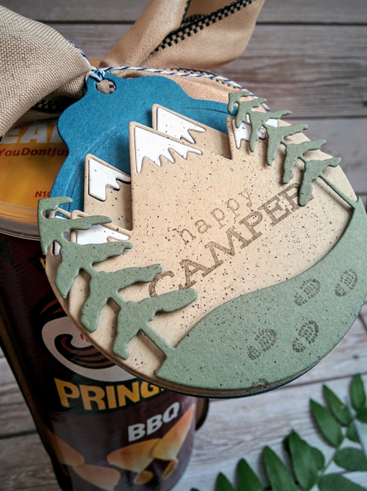
They were also given certain themes for each day as well; a treat, a beauty item, and something spiritual. I made up a quick tag to attach to a package of chips and a little 3 by 3 card she can write a little note in.
The card and tag use the Happy Camper stamp set that is one of my favorites!
You can see it on the chips here. Quick, easy, but thoughtful and not just a container of chips!
The second project is another quick tag and card. I'm sorry to admit that this is the first time I've actually used any of the images from Round Repeats on a finished project. I can tell I'm going to enjoy using it more in the future. I bought it when it was released in 2013 or so... Shame on me for not using it!
The card and tag both use sentiments from the New Every Morning set that I love! I added some turquoise Nuvo drops for a quick embellishment!
I tied the journal and pens up in a satin ribbon and added the cute tag.
I've been SO excited for the Market Street: Make it Market kit and it arrived on Monday. I wanted to use it SO bad but didn't have anyone to make something for, until today! Yay!
The next gift was supposed to be a beauty item so nail polish for the win. I knew it would be super cute inside the flower cart. I watched Betsy's video on assembling tips...I definitely encourage you to watch it.
Here's what I found: definitely reinforce the bottom with a second bottom portion of cardstock. You can see mine bent in this photo, and that was WITH reinforcement. Maybe use your thickest card stock. Also, you will definitely need to attach brads to the awning if you want to get anything in or out! In addition, make sure you line your tabs up the same on both sides...mine is crooked. My dies were VERY dirty (the metal residue) so I encourage you to run them through your machine with scrap paper a few times. I was in a serious time crunch, so I couldn't do this. My poor cart looks like it was in the flower garden itself! LOL! Anyway, I'm excited to work with it some more when I have more time. Thanks for fluttering by!
They were also given certain themes for each day as well; a treat, a beauty item, and something spiritual. I made up a quick tag to attach to a package of chips and a little 3 by 3 card she can write a little note in.
The card and tag use the Happy Camper stamp set that is one of my favorites!
You can see it on the chips here. Quick, easy, but thoughtful and not just a container of chips!
The second project is another quick tag and card. I'm sorry to admit that this is the first time I've actually used any of the images from Round Repeats on a finished project. I can tell I'm going to enjoy using it more in the future. I bought it when it was released in 2013 or so... Shame on me for not using it!
The card and tag both use sentiments from the New Every Morning set that I love! I added some turquoise Nuvo drops for a quick embellishment!
I tied the journal and pens up in a satin ribbon and added the cute tag.
I've been SO excited for the Market Street: Make it Market kit and it arrived on Monday. I wanted to use it SO bad but didn't have anyone to make something for, until today! Yay!
The next gift was supposed to be a beauty item so nail polish for the win. I knew it would be super cute inside the flower cart. I watched Betsy's video on assembling tips...I definitely encourage you to watch it.
Here's what I found: definitely reinforce the bottom with a second bottom portion of cardstock. You can see mine bent in this photo, and that was WITH reinforcement. Maybe use your thickest card stock. Also, you will definitely need to attach brads to the awning if you want to get anything in or out! In addition, make sure you line your tabs up the same on both sides...mine is crooked. My dies were VERY dirty (the metal residue) so I encourage you to run them through your machine with scrap paper a few times. I was in a serious time crunch, so I couldn't do this. My poor cart looks like it was in the flower garden itself! LOL! Anyway, I'm excited to work with it some more when I have more time. Thanks for fluttering by!
Labels:
3-D Projects,
gift giving,
Nuvo Drops,
Papertrey Ink
Subscribe to:
Posts (Atom)