
I have a really bad habit of making sympathy cards that cannot be mailed, yet I generally NEED to mail them! Even though I have a nice stash ready to go, I really needed two that could be mailed! It's been a minute since I used the Fleur Impressions stamp set from The Greetery, so I pulled it out and had some fun inking up the beautiful blooms!
I hadn't decided on a particular color scheme, so I just started adding and layering ink until I was happy with the result. These are all SU! ink pads, which I am finding myself reaching for more and more. They have been neglected for YEARS, yet they have the most prominent and accessible location on my desk, thanks to the fabulous carousel I bought back in my demonstrator days! They are still so juicy and nice, so I may as well use them, right? I still have all the coordinating cardstock as well (thank you crafty hoarder self) ha ha!

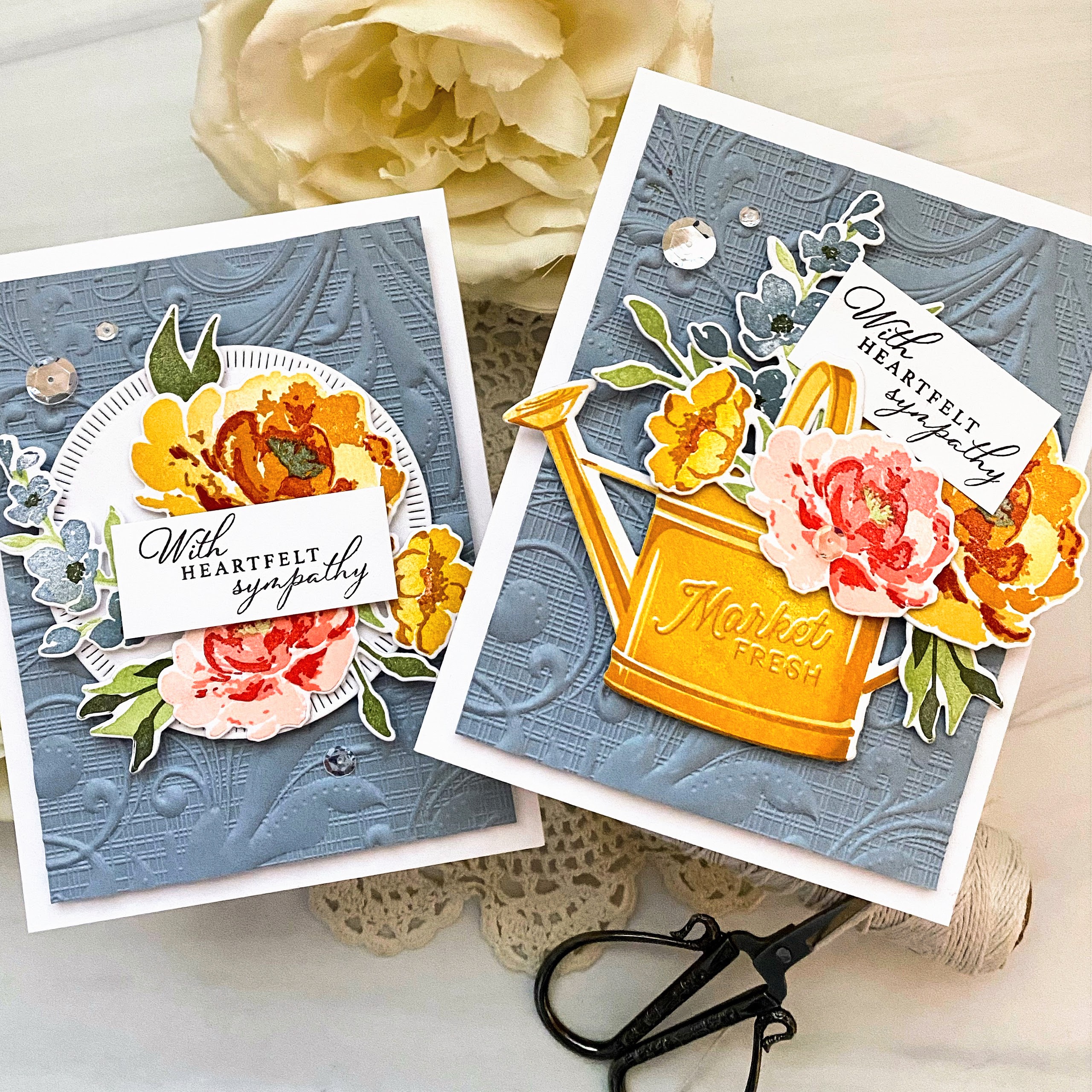
Anyway, I'm rambling....once I had the first, larger bloom inked, I decided to go for warm oranges, ruby, and blush hues for the blooms, but then switched gears for the Bordering Blue tall cluster of flowers. Since these two colors are on opposite sides of the color wheel, you are pretty much guaranteed success!

Both cards feature the same embossed background; I cut two pieces of Bordering Blue cardstock measuring 5 by 3 3/4 inches and embossed them with the Regency Swirls embossing folder; this was included with my Gemini Jr. when I got if for Christmas a few years ago. Because it is so deeply detailed, it made the cardstock very floppy so I adhered each panel to a white piece of card stock that is cut to the same size.

I went rummaging in my "leftover" pile and found this beautiful, yet wonkily cut, watering can! I thought with some strategic flower placement I could make it appear less wonky! ha ha! The recipient of this card is old and doesn't have the best eyesight, so I felt I'd be safe! Now I just need you all to be forgiving, too! LOL!

I used my favorite sympathy stamp set and tucked it up top! I added a trio of sequins and skipped glitter, like I normally would use on a floral design like this.

I also found this die cut circle in my leftover pile so I figured I'd use it as well. I simply clustered the flowers and leaves together and placed the sentiment over the top.

Both focal panels are added to white cardbases using foam squares. I tried hard not to use too much dimension, so hopefully these can still be mailed after all that! ha ha! Thanks for fluttering by!
6 comments:
Kelly, you always make me look at blue from different eyes - LOVE this grey-blue the mostest!!
So beautiful!!
=]
Love your cards. The colors, and texture make me long for Fall, and I haven't even appreciated Summer yet. 3 more months of hectic work schedules and then I will be free again to craft to my heart's content. TFS.
Wonderful cards, Kelly!
I love the colors and your wonkily cut watering can adds character.
Great inspiration!
Have a super day.
absolutely beautiful. I need some Sympathy cards in my stash and I love this inspiration!
GORGEOUS WORK!!!! Kelly, your "wonkily stamped" watering can, is how EVERYONE of my stamped images come out! LOL I have THE HARDEST TIME getting them stamped perfectly! I ADORE your color combination too! (I have the whole SU Set of Inks too, on the carousel! I think they are THE PERFECT COLORS!) AND I also LOVE the texture on the background! STUNNINGLY GORGEOUS!!! ;)<3
Beautiful cards, Kelly. I've had to make a number of Sympathy cards this past summer - more than I would have liked. I'm always looking for a beautiful font/script for a sympathy sentiment. I reach for my Penny Black set, but the PTI is a nice one as well. I love to see cards created with different company products - it's nice when they work well with each other.
Post a Comment