Friday, July 14, 2017

Let's be Mermaids!!!


 How fabulous is this new Mermaid's Tail stamp set?!?! I am completely IN LOVE! I have been absolutely enjoying making bright, fun, and summery cards! As soon as the mailman rang my doorbell with my package from Ellen Hutson I had to play... immediately! Like it says; I'm done adulting...especially with new stamps to play with! ha ha! I shared a sneak peek of this card on Instagram yesterday and I mentioned that it was proving difficult to photograph.
I FINALLY ended up with the best pictures I could get around 6:40 in the evening, which seemed late to get the best light, but it was the best I had all day. I have taken a boat load of pictures of this card!

 To begin, I stamped the mermaid's tail in Versamark ink onto Hawaiian Shores cardstock and heat embossed it using gold powder. After that was done, I used the coordinating designer dies to cut it out. I set that aside so that I could work on a few more elements that I had in mind for this design. I realized after I placed my order, that the stamp set didn't come with any aquatic sea plant images. I don't have anything that would work very well either. I decided to create my own seaweed-esque plants myself. 
 I used a piece of 140 lb cold pressed watercolor paper and painted both sides of it green using the fabulous (and addicting) Zig Kuretake Gansai Tambi pearl watercolors. I painted enough of the paper so that I could cut strips in varying sizes to create the seaweed. I twisted the strips while the paper was still wet from the watercolors so that I could manipulate it into the desired shape. Once they were the right size, I snipped the tips at a sharp angle to make them look a little more realistic.
 I set those aside to dry and got to work on the background. I had watched a video on Jennifer McGuire's blog on water stamping with distress oxide inks and since I just got some, I was dying to try. I used the Glorious Petals stencil from Hero Arts for the actual "water stenciling". I made a card a few days ago using the same technique and the image came out much crisper. I actually didn't mind in this particular case because I didn't want it to compete with the fabulous design on the Mermaid's tail. After that had dried a bit, I added a spritz of shimmer spray like Jennifer had done in her video. The result is spectacular!


 I ended up adding a few more colors of pearl watercolors to the piece of watercolor paper I had been using for the seaweed. I used the seashell die cuts to make an assortment of shells. Because they had the pearl shine, I decided to add some Glossy Accents like I did on THIS card because I liked the effect so well. Once all of my bits and bobs had been created, it was time for the fun part; assembling it all.
 Originally, I had planned on having the mermaid's tail splashing off of the card horizontally, so I heat embossed the sentiment accordingly. I then changed my mind and decided I liked it vertically; as though the mermaid was taking a dive into that glorious ocean. I really liked how the rainbow background ended up looking like a sunset with a deep ocean underneath. I love surprises like that! So...the sentiment is a little off, but I like it anyway!
 I used Tombow Mono Multi to glue the paper seaweed down as well as a few mini glue dots as it would allow. I used a few heavy things around my desk to place on the seaweed so that the glue would dry without is springing back off of the card. The funnest part was adding in all of the seashells, sequins and dew drops. I just HAD to get the mermaid mix sequins! They are INCREDIBLE and they are limited edition, so grab 'em while you can! I also added a light layer of wink of stella to the tail as well! I "may" have been singing "I'm so shiny" from Moana while I was putting this all together! LOL!

To finish it off, I just COULD NOT resist making a little shrinky dink tail! Can you blame me? I mean, look at this cute little thing! LOL! I stamped it in black Palette ink onto the shrinky dink sheet, colored it in a rainbow pattern using Copic markers and then let the heat tool work it's magic! I glued it to the inside of the card with the "just keep swimming" sentiment as well as a few sequins (of course). I also gave the inside a generous spritz of shimmer spray as well. (that's why it appears like the sentiment is grainy, but it's not) I created this card for a friend who has had a particularly bad week and I am certain this will cheer her up! That's what I love about this crazy business!!! Thanks for fluttering by!

Thursday, July 13, 2017

The Challenge #91 Sending you Sunshine!

I am so excited to finally jump on the Oxide ink bandwagon and get inky! Today's new sketch for The Challenge made it possible for me to show off a fabulous oxidized background! I love the result! I can see why these inks are so addictive! I only bought a handful of colors because my birthday is in a few weeks and I wanted to give people ideas of what to get me! Ha ha! Today's design was made using this week's challenge for The Challenge. You can check it out HERE. You can also see the other designers below.                      No automatic alt text available.            
     
I started my design by cutting a 4 by 5 1/4 inch piece of Stamper's Select White cardstock. I used two colors of oxide inks to blend onto the paper; Spiced Marmalade and Fossilized Amber. After I had it blended like I wanted, I stamped a few of the images from the Hello Sunshine onto the background using a combination of water and more ink for a nice layered effect. I also spritzed the entire piece with some water for extra oxidization.
The sunshine sentiment is die cut 4 times out of black cardstock using the Sunshine die and then glued together. Once that was done, I set it aside to dry while I worked on the rest of the card. I cut a piece of white cardstock that would fit the beginning of the sentiment as well as the die cut sunshine portion. I stamped "sending you" in Palette Black ink. The white piece was adhered to a strip of yellow and vellum cardstock for some added interest and to fit the parameters of the sketch. I used my Wink of Stella pen to add sparkle and I also added some Glossy Accents over the entire "sunshine" piece for a fabulous shine! It looks so amazing on the card. I realized mid way through my die cutting that I had forgotten to save the dot for the "i" so I used a drop of ebony black Nuvo drops which was the perfect touch to fix my mistake. It added just the right amount of dimension and shine. I added the entire focal piece to an A2 black card base.
The finishing touches include the two "hello" and "hiya" sentiments stamped and heat embossed added to the card. I usually like to do something clever or unexpected when there is a little detail like this on a sketch challenge. While it isn't super clever, it does add an extra element of whimsy. I also spritzed the sentiment panel with a few markers for some "scattered sunshine" if you will! Ha Ha! A trio of gold sequins finish the design! Thanks for fluttering by!

Wednesday, July 12, 2017

Treats for someone Sweet!

 How many of you knew this was coming? LOL! So far I've made carrotsstrawberries and now watermelon wedges! I knew when I saw the carrot treat box die that I would definitely get my money's worth because the creative possibilities are endless! I experimented with different techniques to achieve the look of an actual watermelon, but ultimately decided on this. I woke up this morning and noticed that the new Color Throwdown Challenge was up and so I quickly finished my project so that I could play! How fitting is this photo??? LOL!
 I was only planning on one, but then when I imagined how cute a half circle of melon would be, I got to work and made 2 more. I actually have 3 people who I wanted to give a little treat to anyway, so I'm excited to have this project done!
 As I was digging through my stash of stamps to find the perfect sentiment, I was thrilled to find that the So Sweet stamp set that was released at the same time as the carrot treat box die, had some fabulous sentiments that work year round! They also coordinate perfectly to fit inside the included tag dies as well. I die cut my tags out of true black cardstock and then heat embossed the sentiment using pink embossing powder. My daughter was looking through my stash the other day and mentioned that I never use pink...she was thrilled that I used it here!


 To begin, I die cut 6 of the carrot treat box die because you use two pieces per box. I added some 1/8 inch scor tape to the tabs to connect the pieces together and then got started with my sponging. 
 I used Fired Brick at the point and then blended in some Worn Lipstick as I worked my way up the box. I ended so that I could leave enough white space like a real watermelon has. I then blended in the cracked pistachio at the top. I expermented with a few water splashing techniques but decided that I liked just spritzing the water directly onto the paper using my spray bottle. 
 I was so excited to make the watermelon seeds! I knew that I could make some very realistic looking seeds by using some Ebony Black Nuvo Drops. I had done some direct to paper seeds on an earlier attempt and realized that they are just too tempermental to risk on something that takes a lot of time. I decided to just make them on some plastic so that I could create them just as I wanted. I ended up making a whole army of seeds! LOL! I needed 12 for each box so I ended up making A LOT because they didn't all end up looking like seeds. 
 I adhered the seeds before I assembled the boxes so that they could dry flat. I used Tombow Mono Multi Glue because it dries clear. That is always a plus! 


I picked up some boxes of Sour Patch watermelon candy at the dollar store which worked out great because they are packaged in a cello bag inside the box. I simply took them out of the box, folded them in half and then stuffed them inside. They barely fit! Whew! I added the gingham ribbon and tag to finish them off! I had so much fun putting these together! Thanks for fluttering by!

Tuesday, July 11, 2017

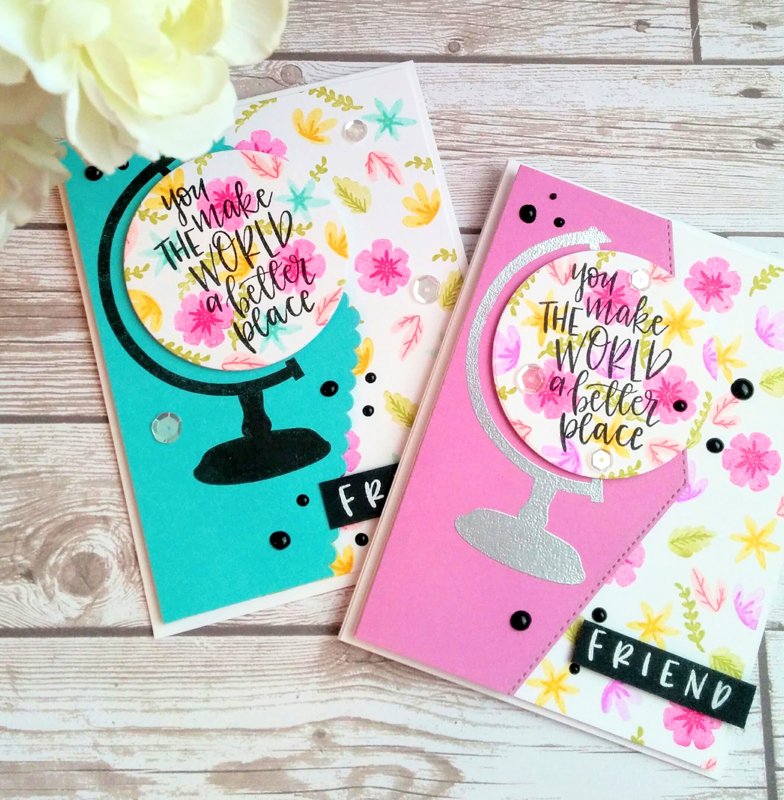
You make The World a better place

Hello! I hope you all are having a wonderful start to your week! I am simply enjoying Summer and all that is has to offer! Summer has never been my favorite season, but I am really enjoying it more and more the older I get. Perhaps it is because time flies so much quicker these days and I am desperate for it to slow down!
One of the main reasons that I am enjoying Summer so much is the added creative time I am getting! It is sunshine to my soul!
I am so happy to be part of a creative community on a regular basis again. It has been fun to reconnect with old stamping friends and make new ones along the way as well. My time away has been spent with my adorable children and babies and I don't regret that ONE BIT! 
I was so happy to sit down and make a few similar cards using Concord and 9th's Globe Greetings and coordinating dies. I have been itching to use this set with all of its darling floral images. I made a few graduation cards with it when I first got it but then it got set aside and now I am thrilled to revisit it.

I started off by stamping the various floral and leaf images onto a panel of Stamper's Select White Cardstock. I only stamped them on the right hand side since I already knew the layout I wanted to use. I stamped off the larger, bold images once and then came back in with the detail images at full ink strength. The only exception to this is the very light pink flowers. The hue of pink was too light to stamp off once, so I decided to choose a darker shade instead. I really like how these turned out. I actually wasn't planning on making a second card, but I was enjoying the stamping process and the result so much I just couldn't stop!


I die cut the globe circle portion out of white cardstock as well and stamped the images exactly the same as before. The fabulous "you make the world a better place" sentiment is simply stamped in black Palette ink. The "friend" sentiment strip is heat embossed in white onto a black strip of cardstock and adhered to the front using foam squares.
I used the To the Point Edgers dies on the colored cardstock, using different designs for each card. I've only used them once so far on THIS card so I was happy to use them again. I know I will be reaching for them often. I made sure to leave enough of the colored cardstock to have enough room to stamp and emboss the globe stands as well. I embossed the stand on the orchid card using silver embossing powder and I just stamped the image in black on the Hawaiian Shores piece. Once all that was done, it was easy to pull everything together. The finishing touches are a few Black Ebony Nuvo Drops here and there as well as a few Sparkling Clear sequins...surprise, surprise! Ha Ha! 
I didn't have a recipient in mind for these particular cards as I was really just making them to scratch a creative itch, but in the end I realized that this sentiment will work perfectly for the cards my daughter and I are creating for the Hope Squad. I stamped the same sentiment on the inside and added a stamped flower and a few leaves. I just couldn't resist adding a tiny shrinky dink using the coordinating "friend" sentiment from the front. It just pulls everything together and it is just so darn cute! Thanks for fluttering by! P.S. I'll be back on Thursday for this week's challenge for The Challenge

Monday, July 10, 2017

I believe in YOU!

 I'm back today to share another design that my daughter and I worked on for the set we are making for her Hope Squad. I wasn't planning on sharing it today but I found out that this stamp set is $10 off, which is an amazing price! 
 We've decided to keep the card set cohesive so there will be a lot of similar elements and colors. I shared the first card the other day which you can see HERE. There is something so magical about these Zig Kuretake Gansai Tambi paints that is so addictive.  I had an idea in my mind that I couldn't wait to execute and it required A LOT of watercolored hearts. I die cut 56 hearts out of 140 lb cold pressed watercolor paper while my daughter watercolored each one. Once I was done, I joined in on the fun!
 In the end, my fabulous idea I had in my mind didn't translate so well on paper so I have a ton of hearts to use on some other projects which will be nice to keep the cohesive feel. Each heart is stacked 4 times and glued together. We worked hard to get the tops of each heart to have some interesting variations and shading. The background is watercolored in a rainbow pattern and this time I made sure that it included purple. My daughter worked hard to make purple for the hearts so we needed to make sure the card front had it as well. These paints blend beautifully! The crazy part is that the finished piece looks and feels like shimmer paper....smooth and shiny, but it is actually thick watercolor paper! With the Pearl paints and the embossing, it completely transforms the texture! 


 I absolutely LOVED the effect that the last card had using the deeply etched embossing folder. I chose a cuttlebug embossing folder that actually "debosses" rather than "embosses". We chose this particular design because the flowers are made up of heart images, which is perfect for this design.


The sentiment, which is from the Hero Arts "You are Loved" stamp set, was stamped in Versamark ink and heat embossed with white detail powder. This particular set was designed to give others encouragement and part of the profits will be donated to the "anti-bullying" campaign which is what my daugther's group the "Hope Squad" works on as well as suicide prevention, etc.
 I die cut a circle near the top and then adhered the entire watercolored piece to an A2 card base. The sentiment is placed over the circle and adhered using foam squares. I originally stamped the sentiment in black ink onto white paper, which I liked, but in the end it felt too washed out so I switched to black. 


 Once that was done, it was time to place the hearts scattered across the front. It was fun matching up the hearts to the perfect spot on the card front. And, because they look so darn cute, we just HAD to add some rainbow sparkle jewels. They are addictive as well. I added them in the same way I have in the past, placing them onto the card nearest the color that they match. I love the iridescent quality that they have in combination with the pearl paint; a match made in heaven!
 I felt quite pleased with the results, but wanted to give the hearts a little something extra. I tried this on one of the extra hearts first, to see if I liked it, and in the end I LOVED it! I added some Glossy Accents like I did to the hearts on THIS card, but restrained myself on THIS card because I wanted the beautiful watercoloring to be the focus! NO!!! Let me tell you...the glossy accents MAGNIFIES the watercolors, the pearl quality...it is JUST GORGEOUS! I tried to take a closeup of it here for you to see, but in real life it is amazing!!!!!I'm thinking of adding it to the last card because it is just so beautiful!
I made sure not to neglect the inside of the card and I'm just having too much fun with the Shrinky Dinks still. Also, they will give the whole set and extra dimension of cohesion. I stacked some hearts that were punched out about 4-5 times and then glued the sentiment using Tombow Mono Multi to the heart. I like this particular glue because it comes out white so that you can see where it is, but it dries perfectly clear. I also added a sprinkling of rainbow jewels for sparkle and continuity. Thanks for fluttering by!

Thursday, July 6, 2017

The Challenge #90 Hugs and Happy thoughts

I am completely in LOVE with this week's challenge photo! I had SO much fun putting this week's card together! You can check out all of the details HERE and you can see what all of the other design team members came up with as well 
Image may contain: people sitting
I would be pleased as punch if this chair were in my home! It is absolutely gorgeous and the perfect starting point for a fabulous floral card! It reminded me so much of THIS card that I made a few years ago so I wanted to use some new floral images for today's design.

My starting point was this fabulous set called Beautiful Day which has images similar to the floral images used in the textile on the chair. It has the perfect balance of leaves, florals and sprigs of greenery to create something similar. As you can see, I took a very literal approach for my design. 
To begin I took some time out to create masks for each of the large images so that I could build a fabulous floral scene. I had so much fun placing things here and there. The new To the point edgers dies arrived while I was away with my husband so I was excited to use them on this design.I thought the way I used the scalloped die made it seem like the top of the chair, which you can't see in the photo, but I used my imagination.


I used a mixture of solid images as well as the line art images that are included in the set. I like the mix and I feel as though it works well to recreate a textile look. The line art images are colored using Copic Markers and the solid images are stamped in a variety of ink colors for maximum definition.
The sentiment is heat embossed using white powder onto a black strip of cardstock. I added a few sparkling clear sequins here and there. After all of that was done, I adhered the focal image onto a piece of black and white striped paper using foam squares. I adhered all of that onto a black card base. I really went back and forth between a white or black base. I liked the white better, but ultimately, the black won because the frame of the chair looks so stark against the fabric and the black had the same effect. Thanks for fluttering by!


Wednesday, July 5, 2017

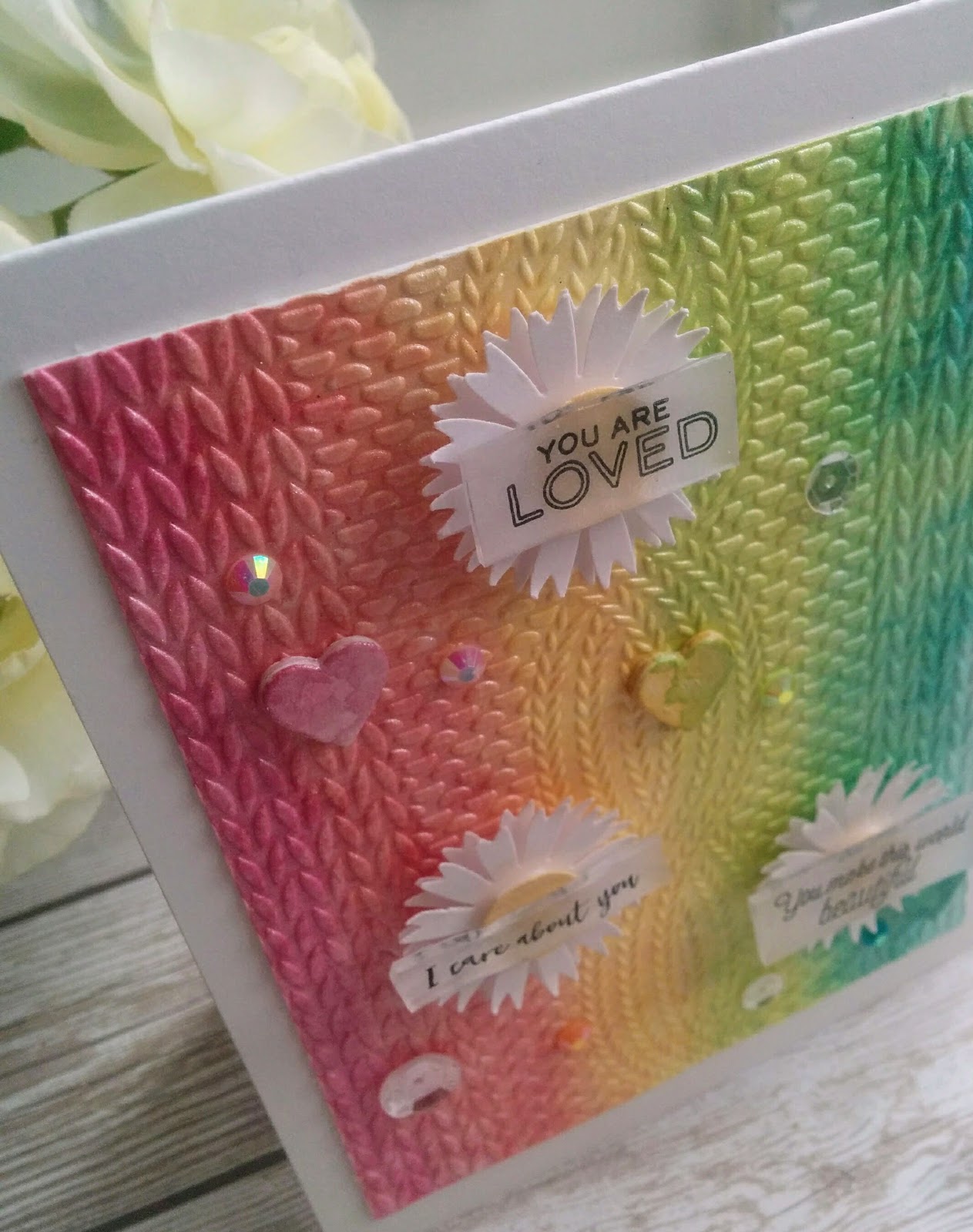
You make the world beautiful


I hope you all had a wonderful Independence Day! We had fun as a family going to the parade, backyard BBQ and Fireworks! I had an awesome time with my husband over the weekend at my nephew's wedding as well. I was itching to get back to my creative space to work on this week's design for The Challenge which I will be sharing tomorrow as well as a few other ideas that have been floating through my mind. When I was a kid, my sister and I absolutely loved Shrinky Dinks and then I fell in love AGAIN when I would use them at my SU! workshops YEARS ago! I decided it was high time to revisit all of the fun that they have to offer!!!
It's not often that I use multiple sentiments on the front of a card, but with the fabulous You are Loved stamp set and shrinky dinks, it made it possible to use them all together for a cohesive look. I ordered some "Rough and Ready" shrinky dinks from Amazon since I can't find my old stash of SU! sheets. I really like how easy it is to stamp and color on the rough side. I chose three of the sentiments that worked well together in theme: You are Loved, I care about you, and You make the world beautiful! My daughter is a "Hope Squad" member at her school and we have decided to work together to create a set of handmade cards that she can take to school in the fall. These cards will be given to the teacher in charge of the "Hope Squad" and they can be used as needed. The "You are Loved" stamp set is perfect for this. I got it for Mother's Day and am so excited to get it inky.
To begin, I created a pearlescent watercolor background using Zig Kuretake Gansai Tambi pearl colors. I used 140 lb. coldpressed watercolor paper to create a wash of gradiant colors included in the set. I just went from one color to the next, omitting the white. Once it was dried, I used the fabulous knitted embossing folder from Richard Garay. 


Before I began the card, I experimented A LOT with different shrinky dink elements: die cuts with stamping, sentiment strips with punched holes, Copic Coloring and more. You can see a little sample of them in the background of this photo. Don't worry, I'll be sharing lots more ideas using shrinky dinks because I just can't stop! LOL!
I was finding that some of the sentiments were coming out warped, which is common and it was really bugging me. After I fussed at trying to get the "perfect" piece, I decided to embrace the imperfection and use these pieces on today's design. The "I care about you" piece was wonky and curvy, which in the end, I really like!

I punched out some daisy-ish looking flowers using an old Martha Stewart punch as well as some yellow centers. I love how the sentiments look glued over the top. I also added some Rainbow Sparkle Gems placing them over the background where they blended the best. I did that in my last card which I just love! I also added three Sparkling Clear sequins as well as three watercolored hearts. 
There is a heart image included in the stamp set, but because of my textured background, it would be impossible to add them and I didn't want the stark outline. Instead, I opted to use the tiny heart die that is included in the Beautiful You die collection. I used it on THIS card but added glossy accents over the top. On today's card, I just watercolored the hearts using the pearl watercolors and stacked 4 on top of each other. I had a lot of fun creating this card and I can't wait to make more for my daughter to take to school. It will be a fun project that we can work on together! Thanks for fluttering by and join me tomorrow for a fun new challenge!