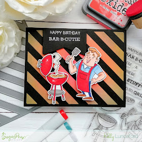
Welcome to day 2 of the SugarPea Designs Sweet Peek Week! Today we're heating things up with some fun summer themed products that are sure to get your mouth watering and get your creative juices flowing as well! I have two projects to share with you today, so make sure to scroll down to see both! There will be a lot of fun inspiration for you today on each of the designers' blogs so make sure you stop at their blogs to see what they've come up with!

The inspiration for today's design came from the actual grill itself; I thought it would be fun to create a Distress Oxide panel that looked like flaming hot coals/or fire and then layer the Diagonal Striped Coverplate die cut from black cardstock over the top to look like the grill plate. The images are from the new Grill Master stamp set and I stamped them in black ink onto white paper and then colored them using Copic markers.

I die cut the images using the coordinating Grill Master SugarCuts and added them to the front of the card. The sentiment, which is also from the new set, is heat embossed in silver onto black cardstock. Once that was done, I die cut it using one of the elements from the Card Front Element Builder II to give it the notched detail.

I love that you can add a steak, hotdogs, or hamburgers onto the grill! This is such a fun set and is perfect for my husband's June birthday!
My next card features a fun new sentiment set paired with a fabulous new SugarCut set as well! The "Relish the day" sentiment is from the King of the Grill Sentiments stamp set. I had this fun idea to make my own paper hamburger with the sentiment as the focal point. What do you think? Does it look like a hamburger?

To begin this design,I die cut the Eyelet CoverPlate out of red cardstock and layered it onto a standard white A2 cardbase. I die cut a white panel using the Zig Zag Stitched Rectangles SugarCuts so that I could layer on the hamburger elements.
The "bun"was created by using the circle from the Card Front Element Builder II. I die cut it out of Kraft cardstock and then added some ink splatter for some toasty/ wheaty elements! LOL! The sesame seeds are white nuvo drops. The lettuce was made by spritzing some green cardstock with water and then crumpling up the paper and allowing it to dry.I sponged green ink on the edges for some extra detail.
The mustard and ketchup bottles and the spatula are from the new Backyard BBQ SugarCuts.They are sooooo cute and I can't wait to use them some more! I had so much fun creating both of these projects! Join us again tomorrow for even more sneak peeks of another super fun new set! Thanks for fluttering by!


Love the background on the first one. Your coloring is awesome!! The hamburger card is so cute, I love it!!
ReplyDeleteThe hamburger is so creative- it's awesome!
ReplyDeleteWhat a lovely set of cards!! I like the second one a lot :)
ReplyDeleteawesome cards - love the second one - yummy
ReplyDeleteLots of fun elements to relish! :)
ReplyDeleteSUPER cute!!! I love the bold colors on your first card. And the burger on your second one... oh my! You are so clever!
ReplyDeleteGreat summer designs! Love the BBQ SugarCuts.
ReplyDeleteLove these fun cards. Your background on that first one is gorgeous...wonderful cover die.
ReplyDeleteLove the first card, and that Diagonal Striped CoverPlate - it's now on my wish list.
ReplyDeleteThanks for the inspiration.
The background for dad looks perfect. It reminds me of a hot grill. Stay cool, Dad....
ReplyDeleteIncredible background on the first one and I LOVE how you made the hamburger on the second! GREAT SET!
ReplyDeleteSuch fun cards. Nice work!
ReplyDeleteSo adorable!
ReplyDeleteThat hamburger is adorable.... relish is my favorite topping!!
ReplyDeleteMarisela Delgado said: Such great cards. mariandmonsterd@yahoo.com
ReplyDeleteBoth of these are so cute and colorful.
ReplyDeleteWhat a wonderful set of cards!! Love this new release.
ReplyDeleteLove the background on your first card. That second card is awesome!! Yes, it does look like a hamburger. Well done! No bun intended. Ha
ReplyDeleteAwesome cards, I especially love diagonal stripes on the first card!
ReplyDeleteI really like the red glow in the background around the grill in card 1.
ReplyDeleteAnd, YES, it totally looks like a hamburger! Very clever and original! Love it!
Oh my! How funny! Stunning cards!!!
ReplyDeleteAwesome masculine cards. :)
ReplyDelete